Tap2
Categories
Role
- Branding design
- Visual identity
- Motion design
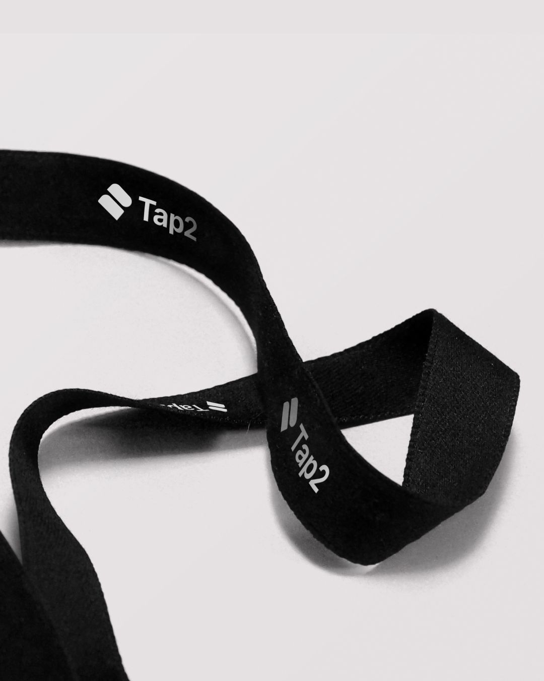
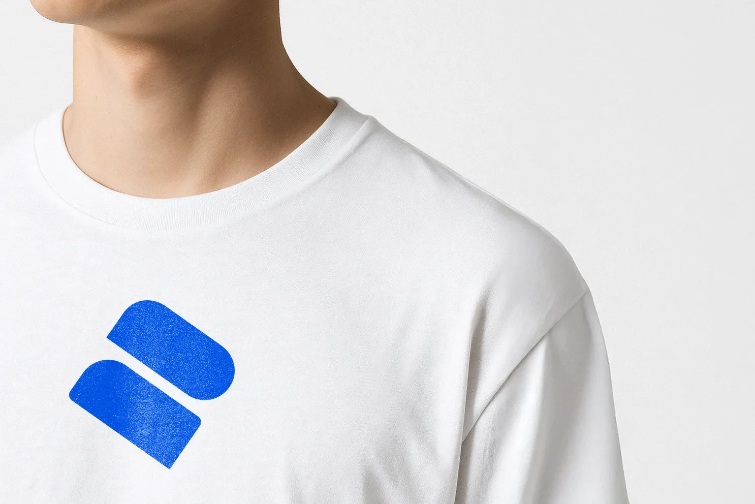
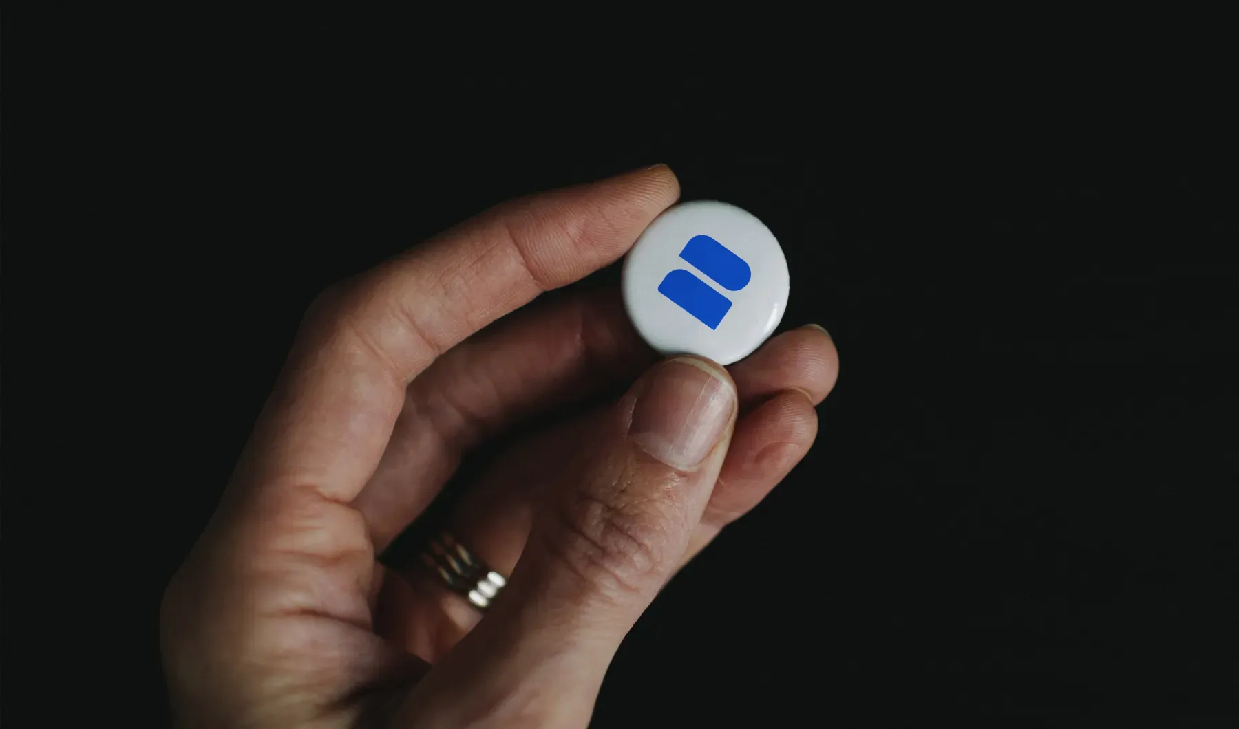
- Merchandising
- ADV
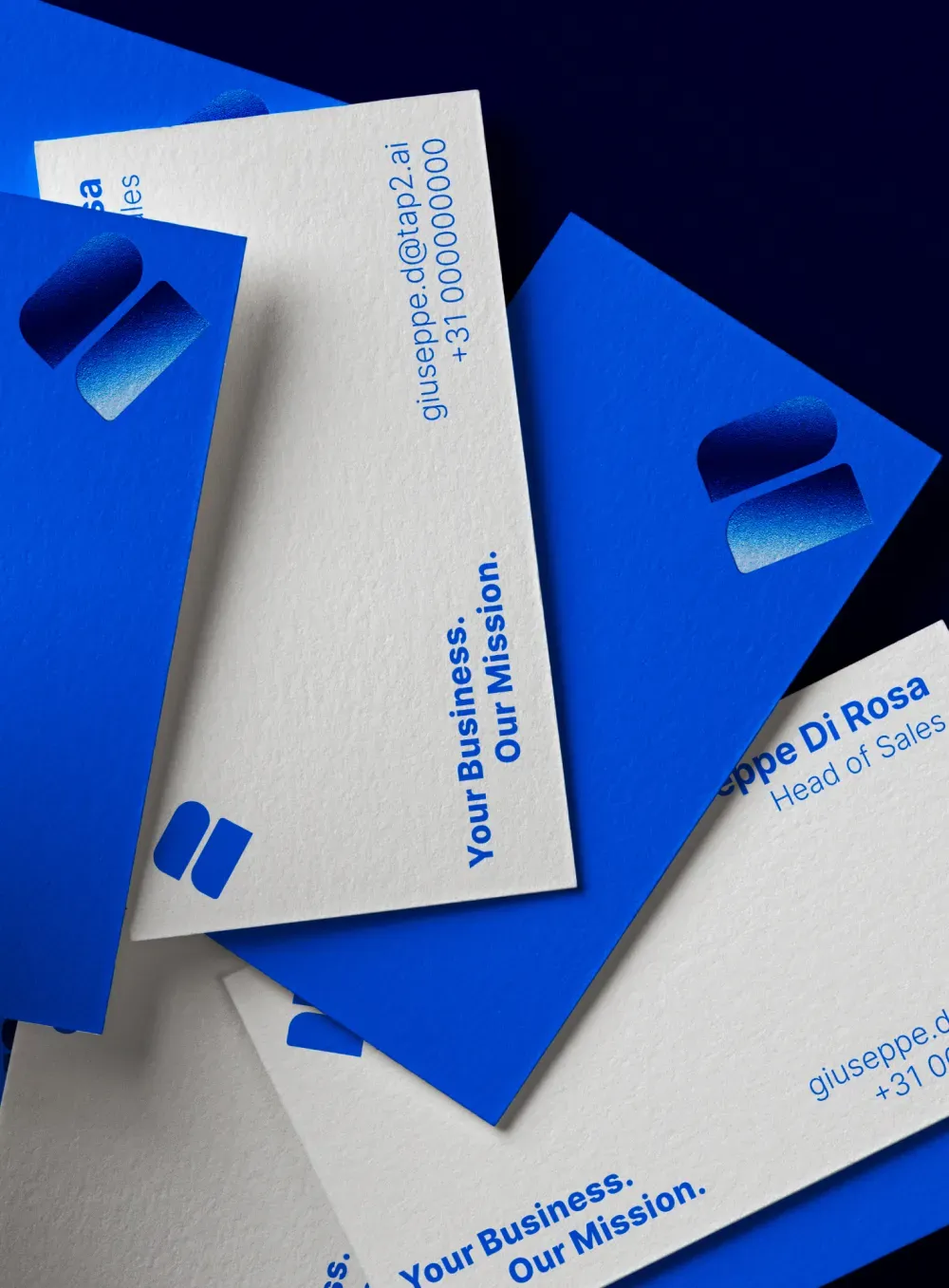
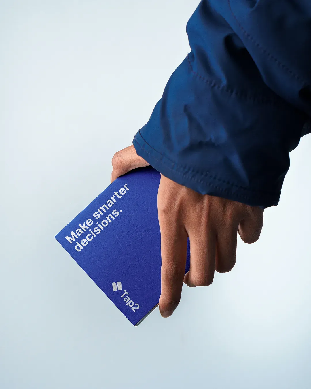
(INFO) TAP2 is an AI-first ERP system born between Italy and Netherlands, designed to optimize payment processing, employee scheduling, and data analysis, all through a mobile-first experience tailored to the restaurant industry. We were asked to create a brand identity that would resonate with a Dutch audience used to minimal and rigorous design, while still leaving room for international growth.

Concept
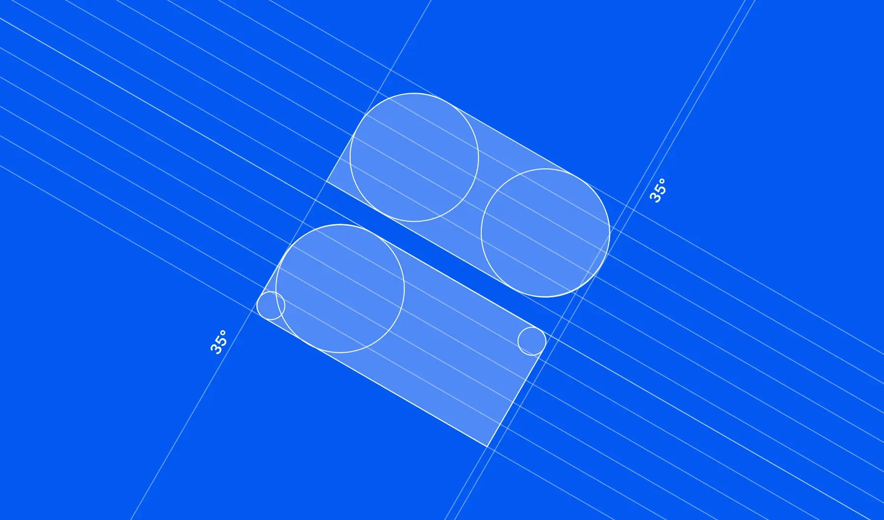
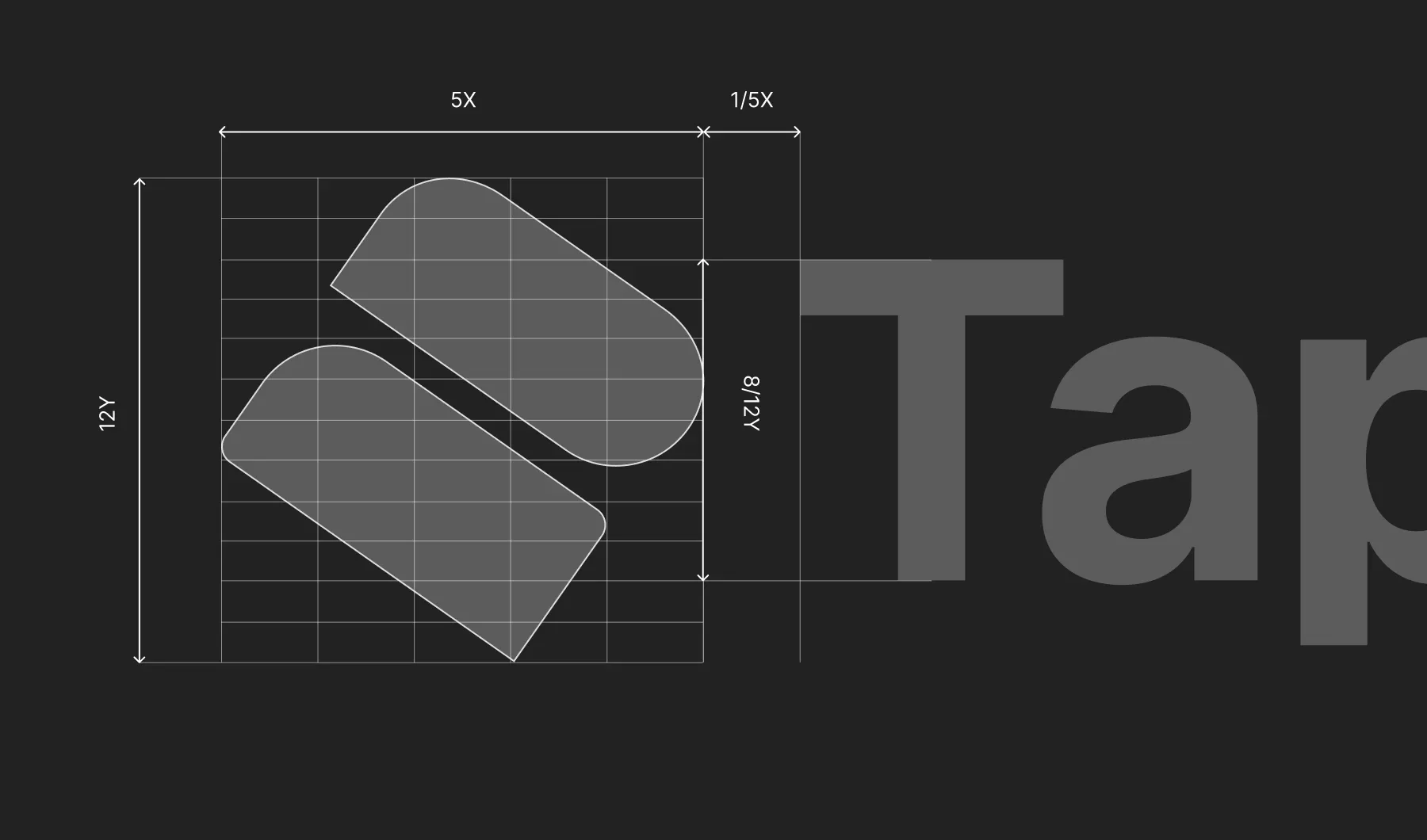
The TAP2 logo is built on a clear conceptual foundation:
Two stylized POS devices, viewed from the side, form the number 2, a core element of the brand’s name. The symbol is tilted at a 35° angle to suggest motion, digital flow and a tap gesture, a nod to fast interactions and real-time operations.
Visual system
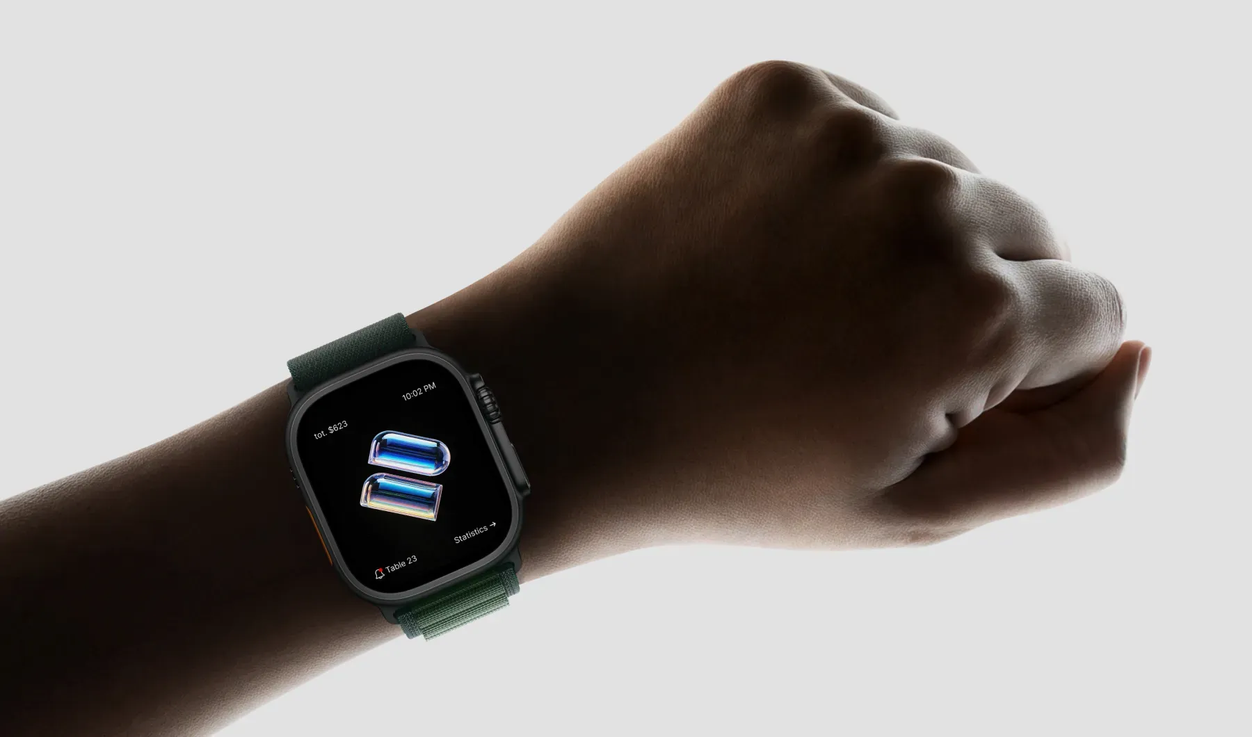
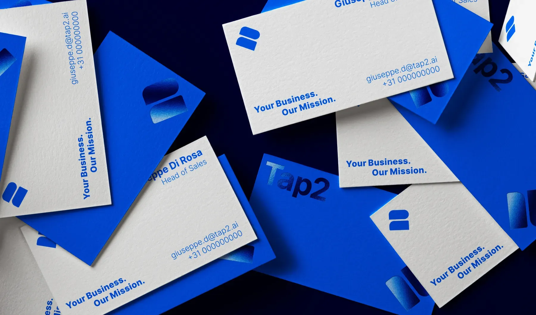
The visual language combines strong geometry with soft gradients and 3D glassy elements to express clarity, depth and tech precision. The typography is clean and modern, designed for UI readability and brand consistency.
The symbol adapts across different contexts: from app icons and product UI to physical devices and printed materials, maintaining clarity at any scale.
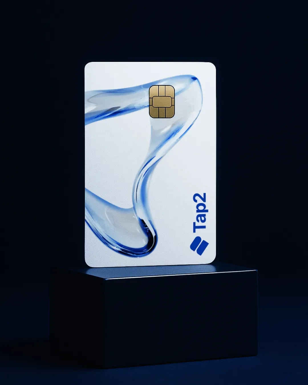
Visual Style & 3D Elements
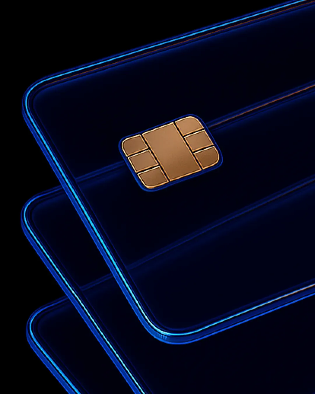
We enriched the brand with 3D-styled visual assets representing the ecosystem around TAP2: credit cards, stylized POS terminals, digital coins and mobile phones, all rendered with a glass-reflection style.
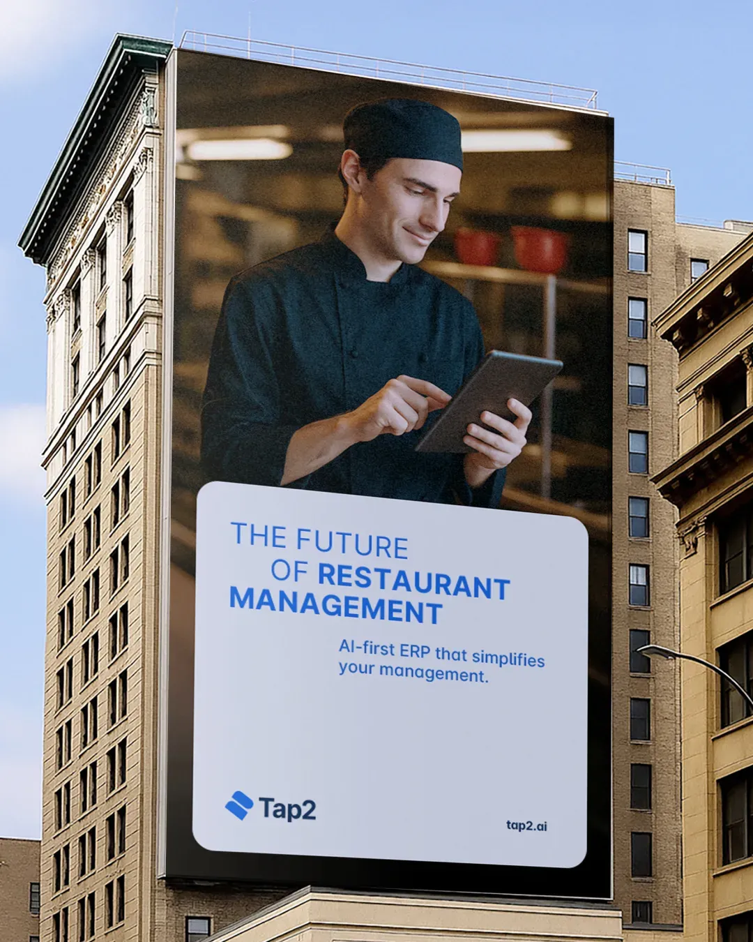
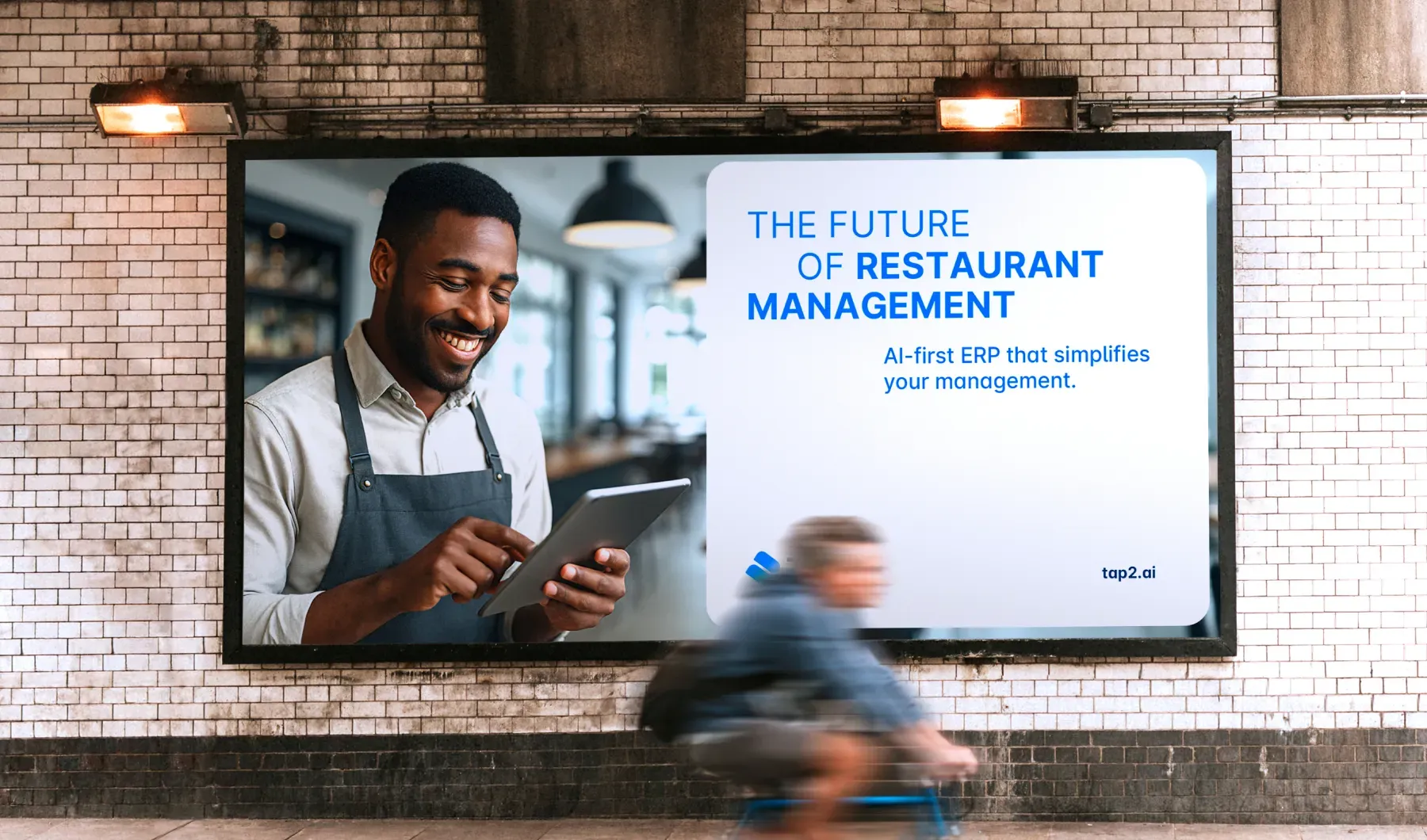
ADV
We also handled the visual direction of the launch campaigN, including outdoor posters and billboards — reinforcing brand awareness through sharp, essential visuals.

ACAF / Riti della Settimana Santa