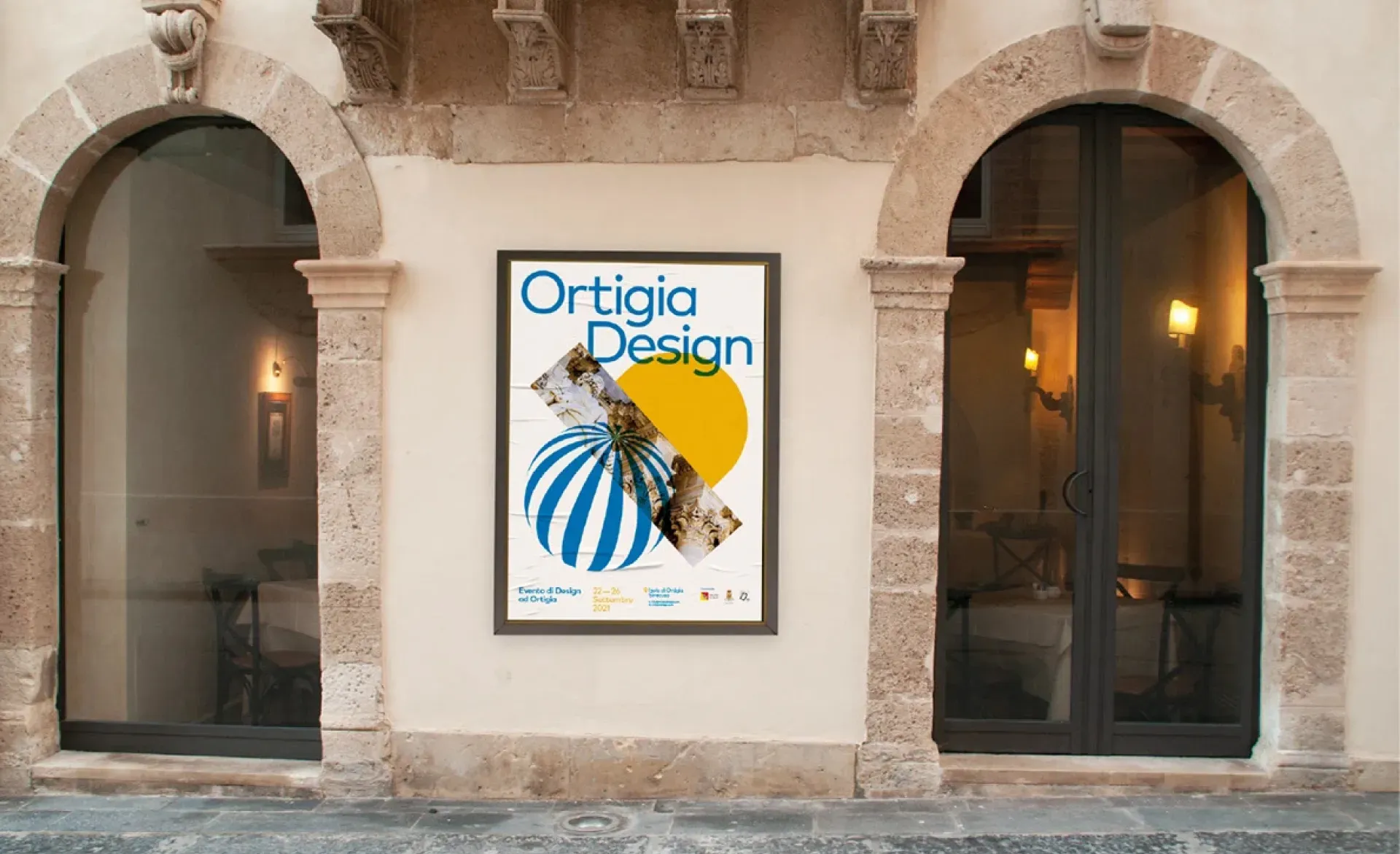
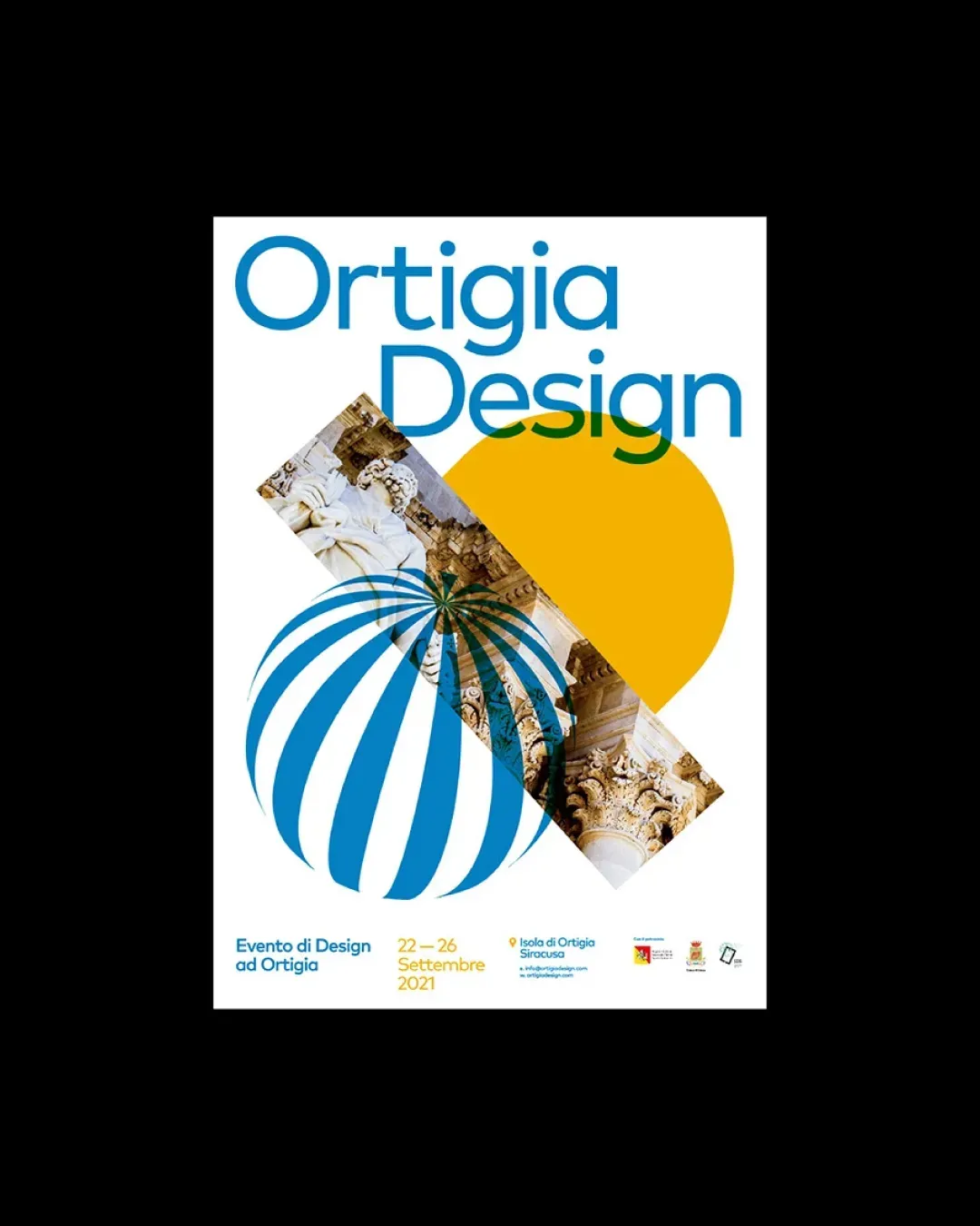
Ortigia Design
Role
- Branding
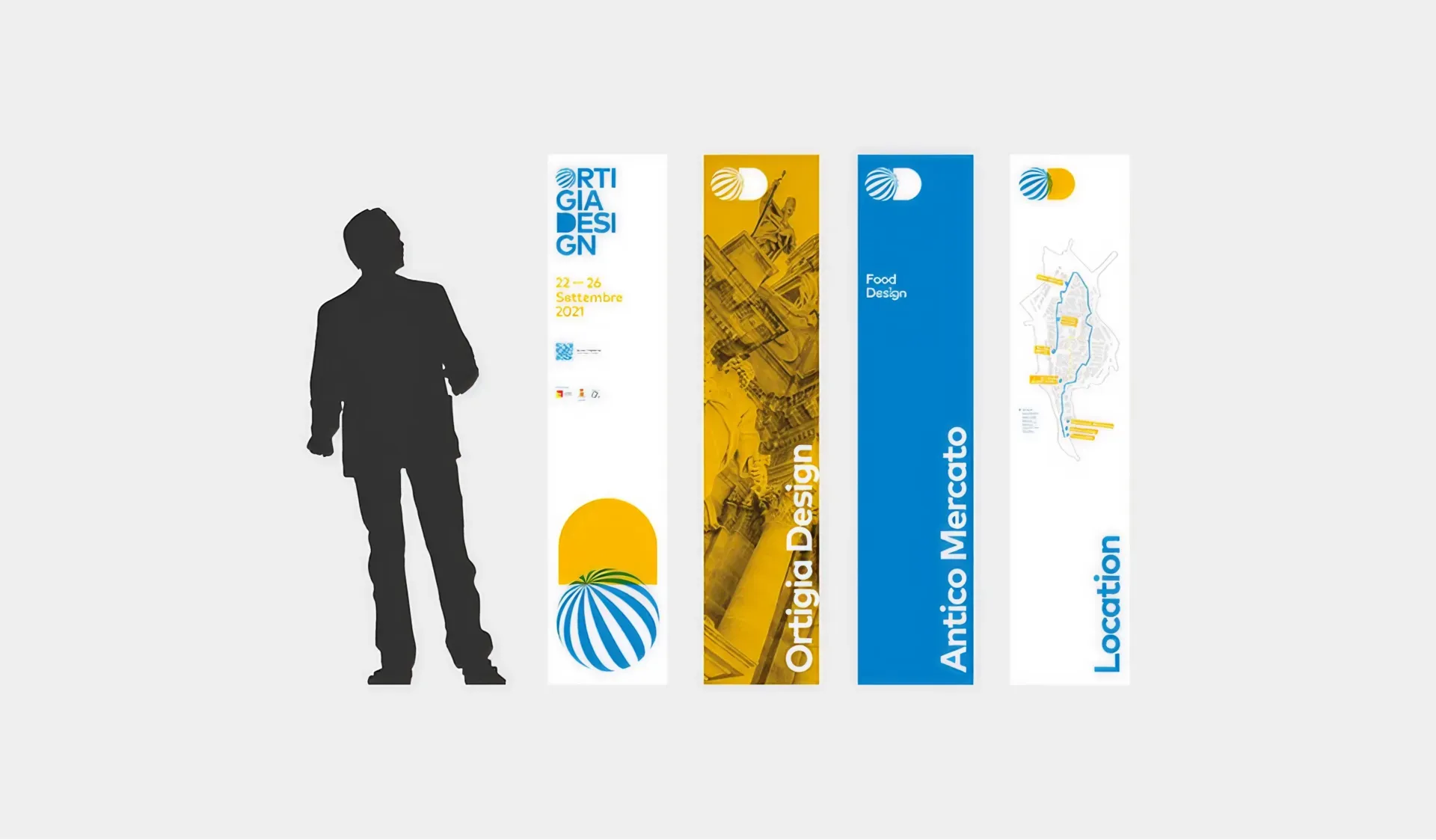
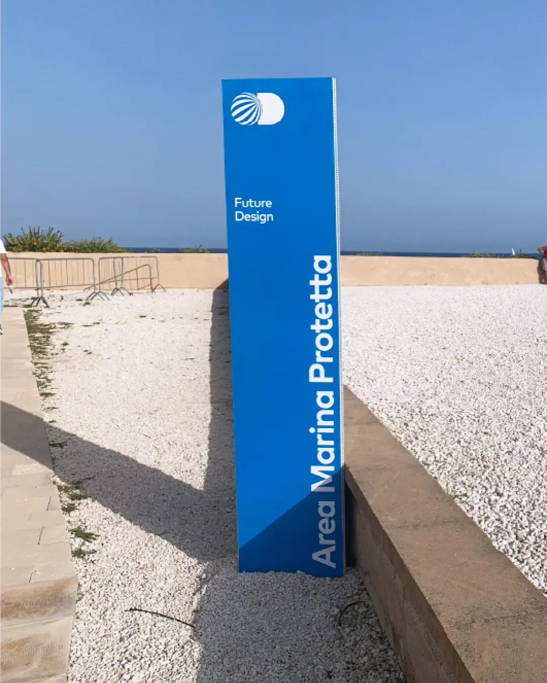
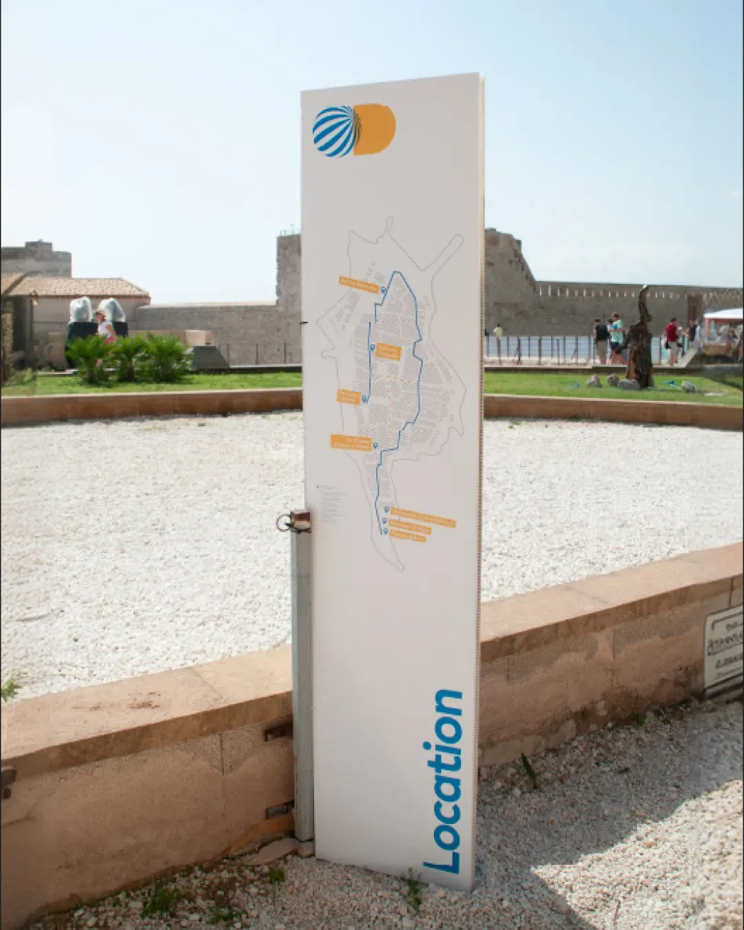
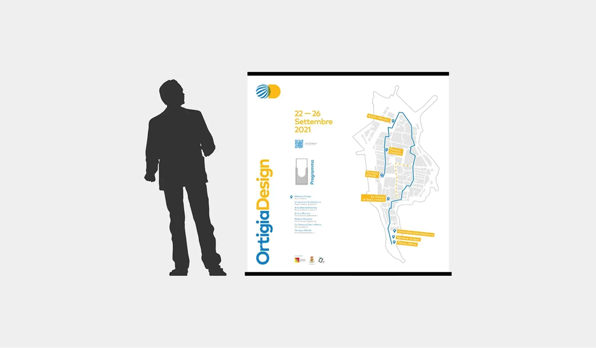
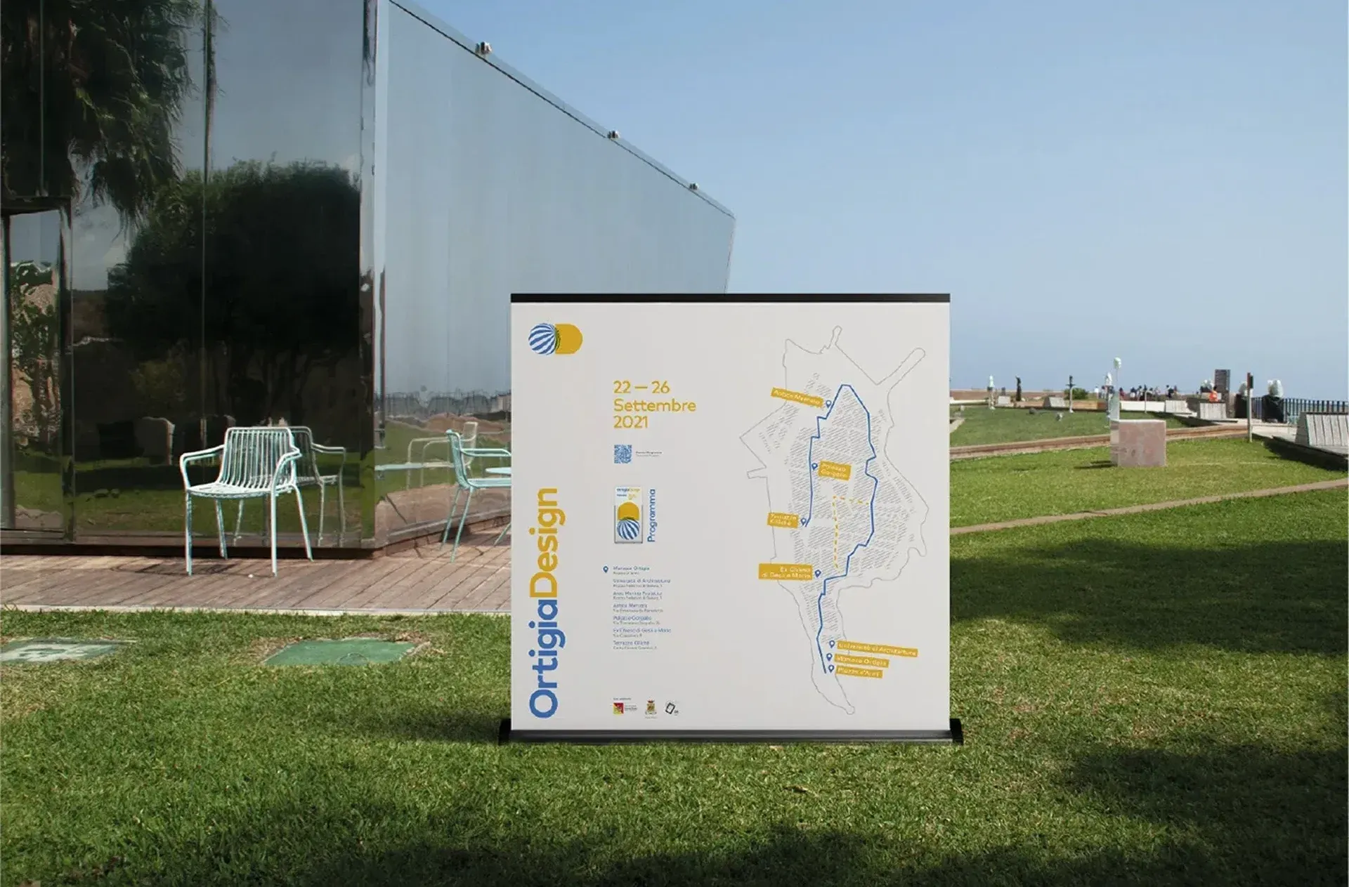
- Wayfinding
- Social Media Manager
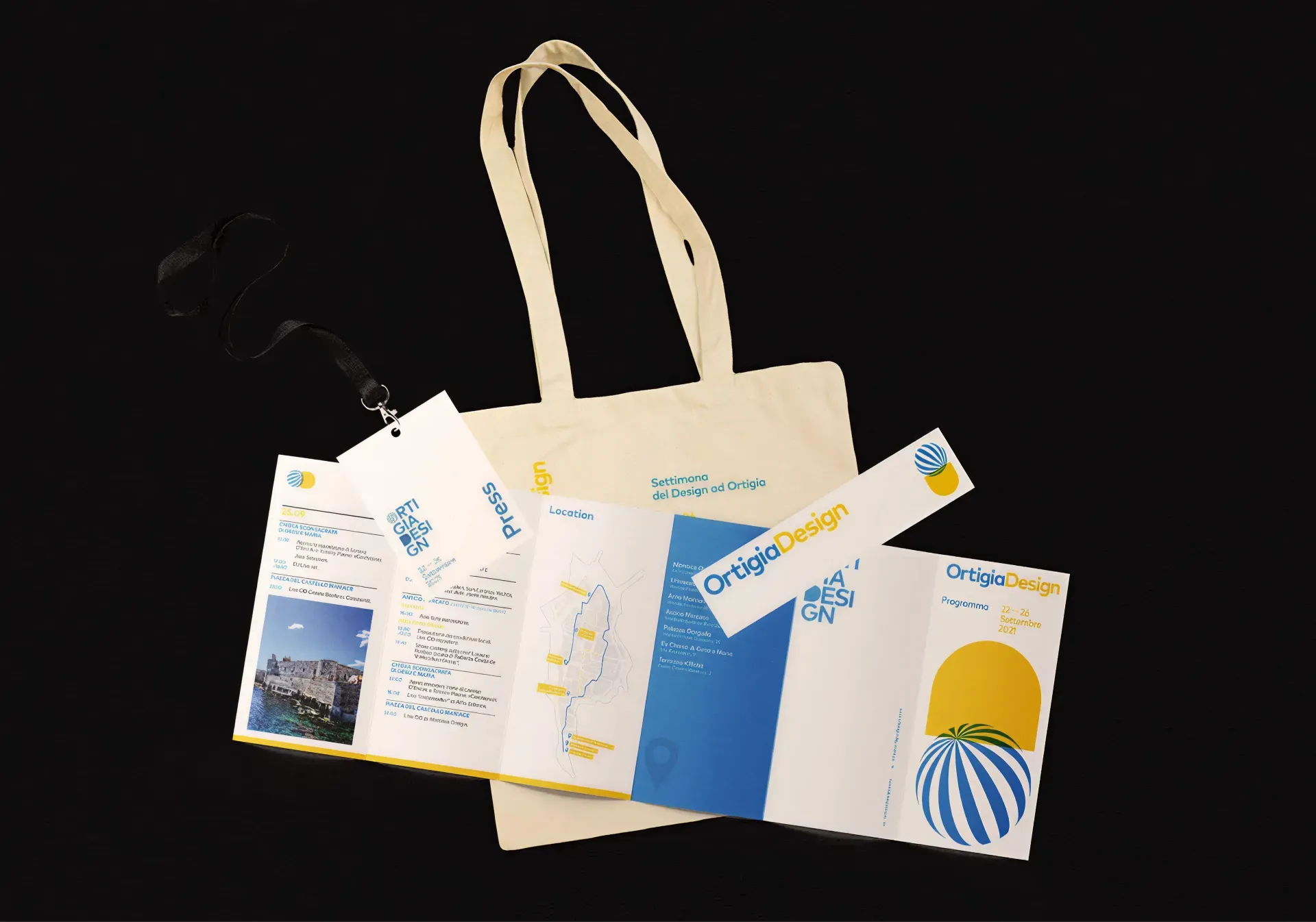
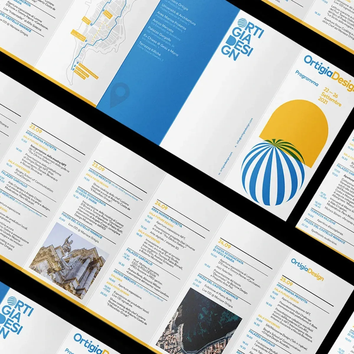
- Editorial Design
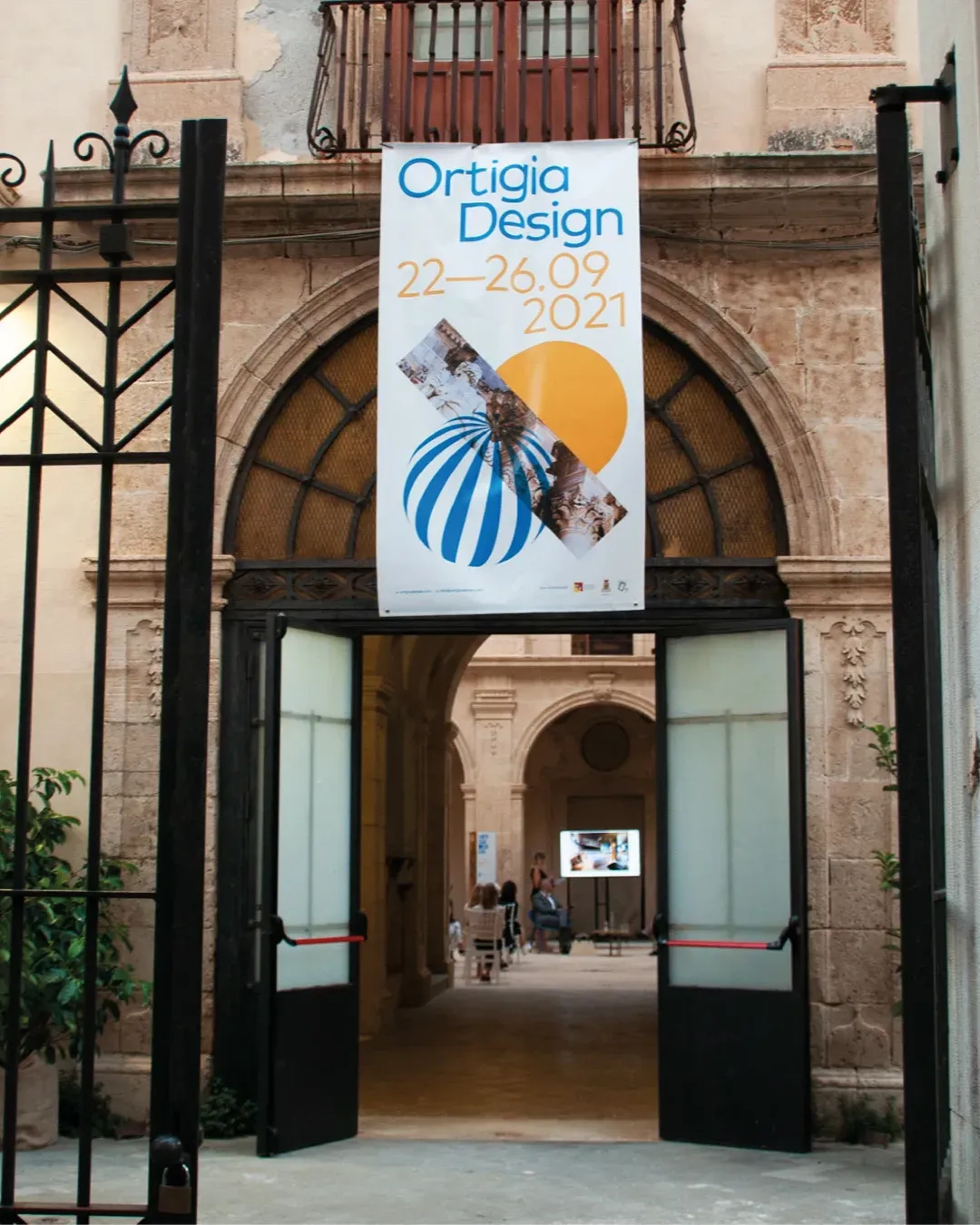
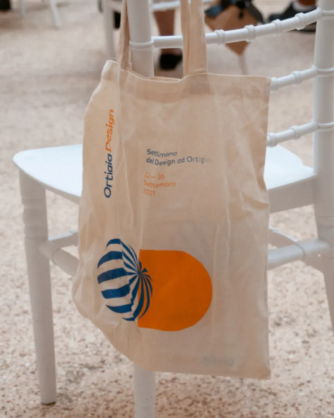
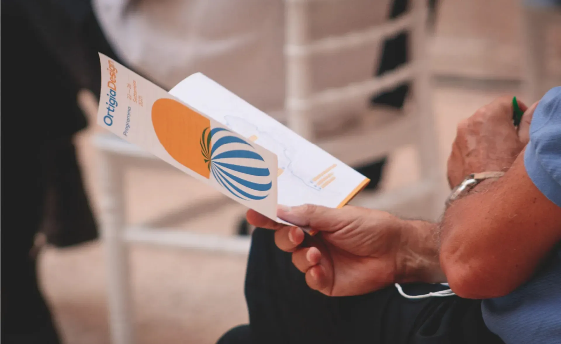
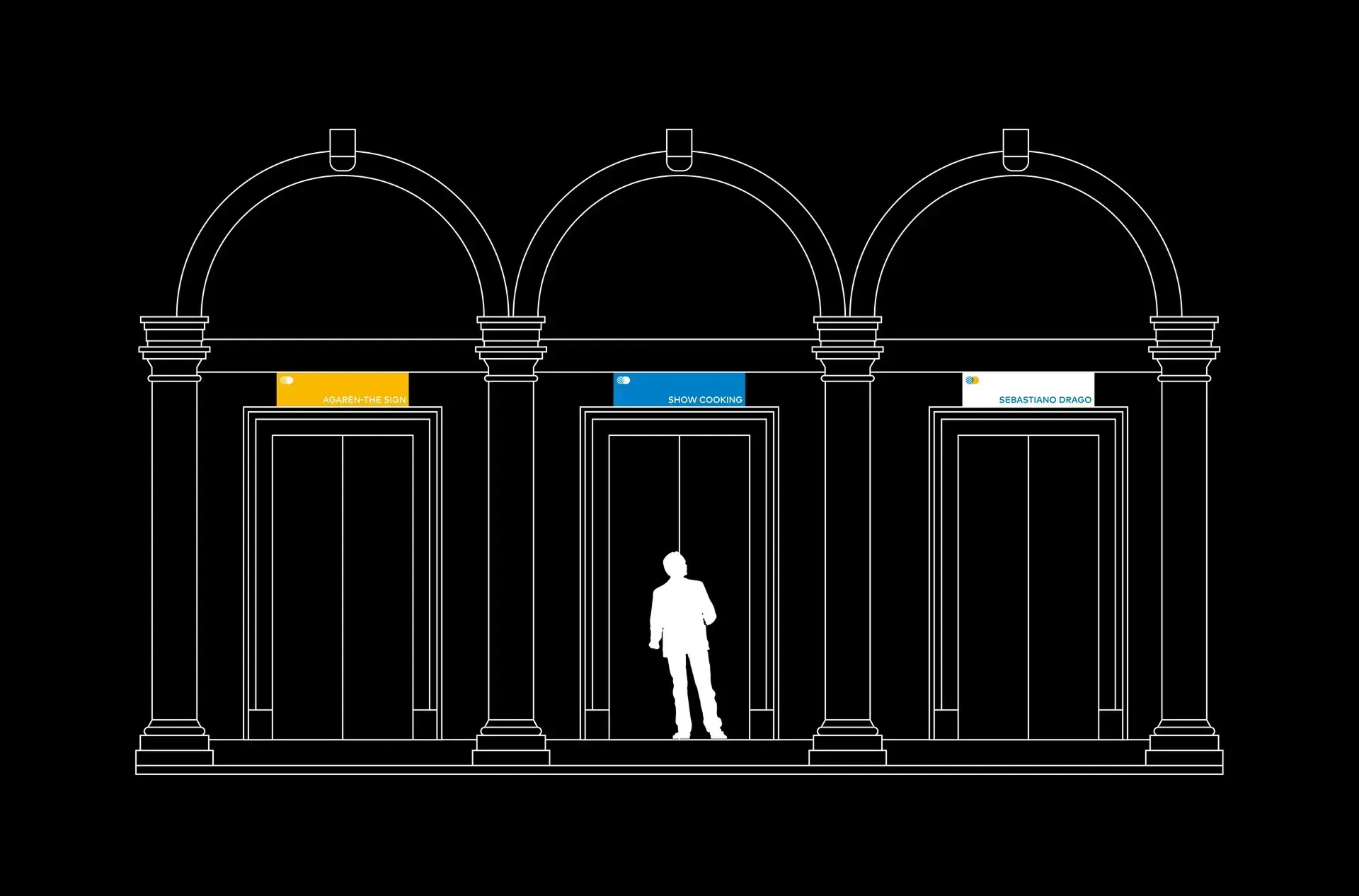
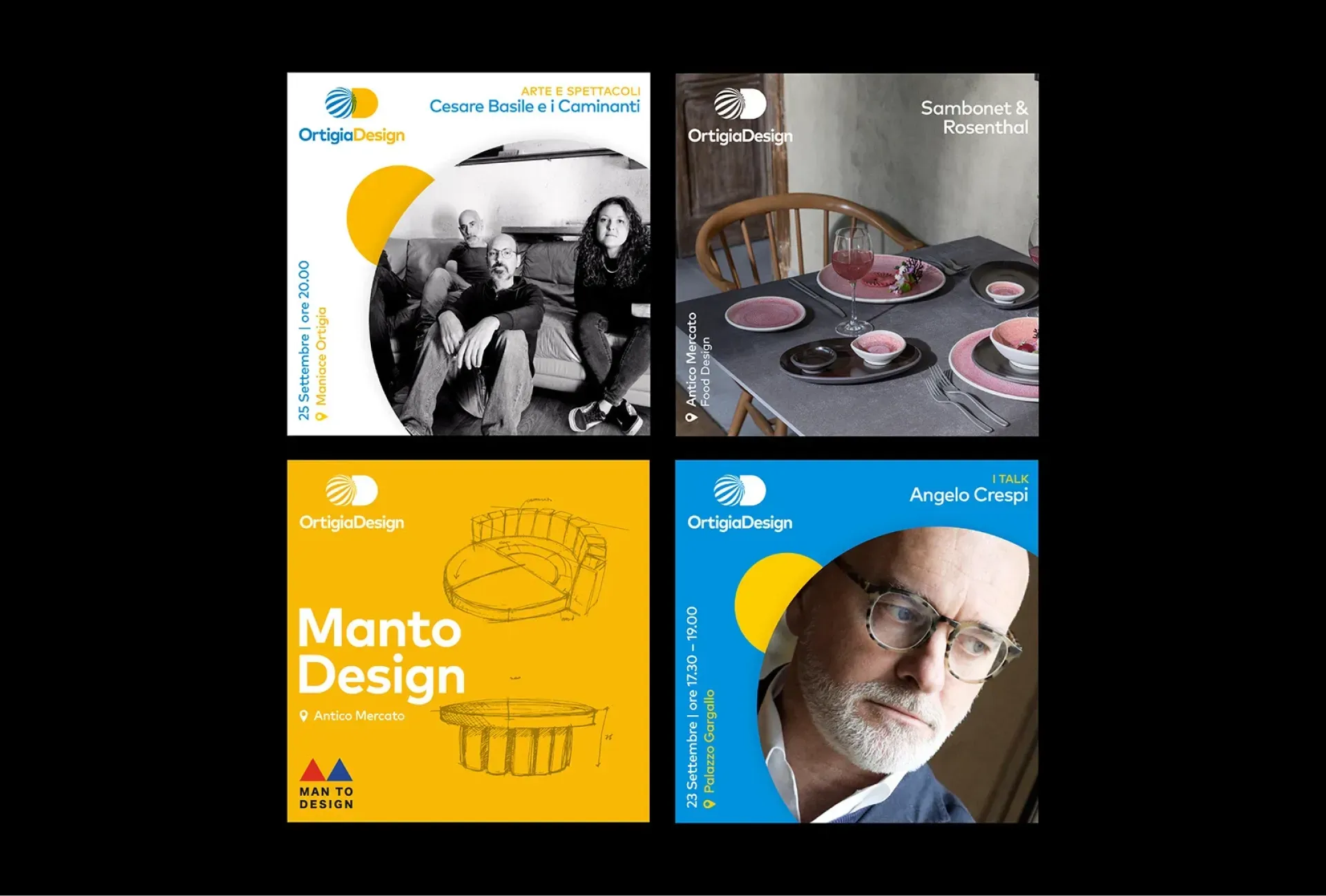
(INFO) Ortigia Design is a design event that took place on Ortigia Island, Syracuse, Italy from 22 to 26 September 2021. The event involved some important design brands such as Bertone Design, Man To Design, San Lorenzo Yachts, architects and designers from all over the world. The event organisers asked us to design the identity of the first edition of the festival. The aim was to design a brand linked to the territory, but capable of conveying a sense of design.
Concept
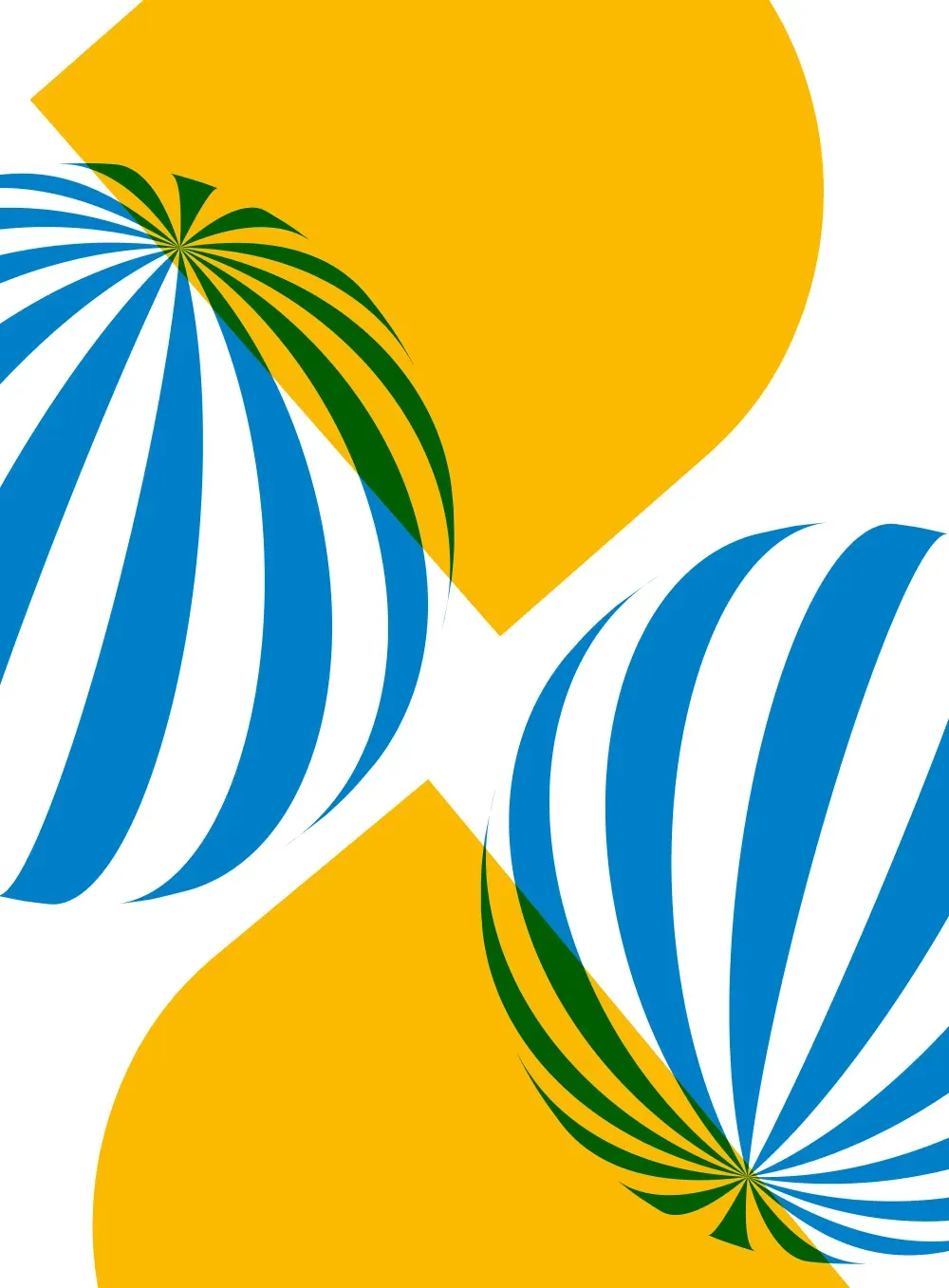
Taking two simple geometric shapes, square and circle, as a model, we drew an O and a D full, initials of the words "Ortigia" and "Design", joining them together to obtain a first simple symbol.
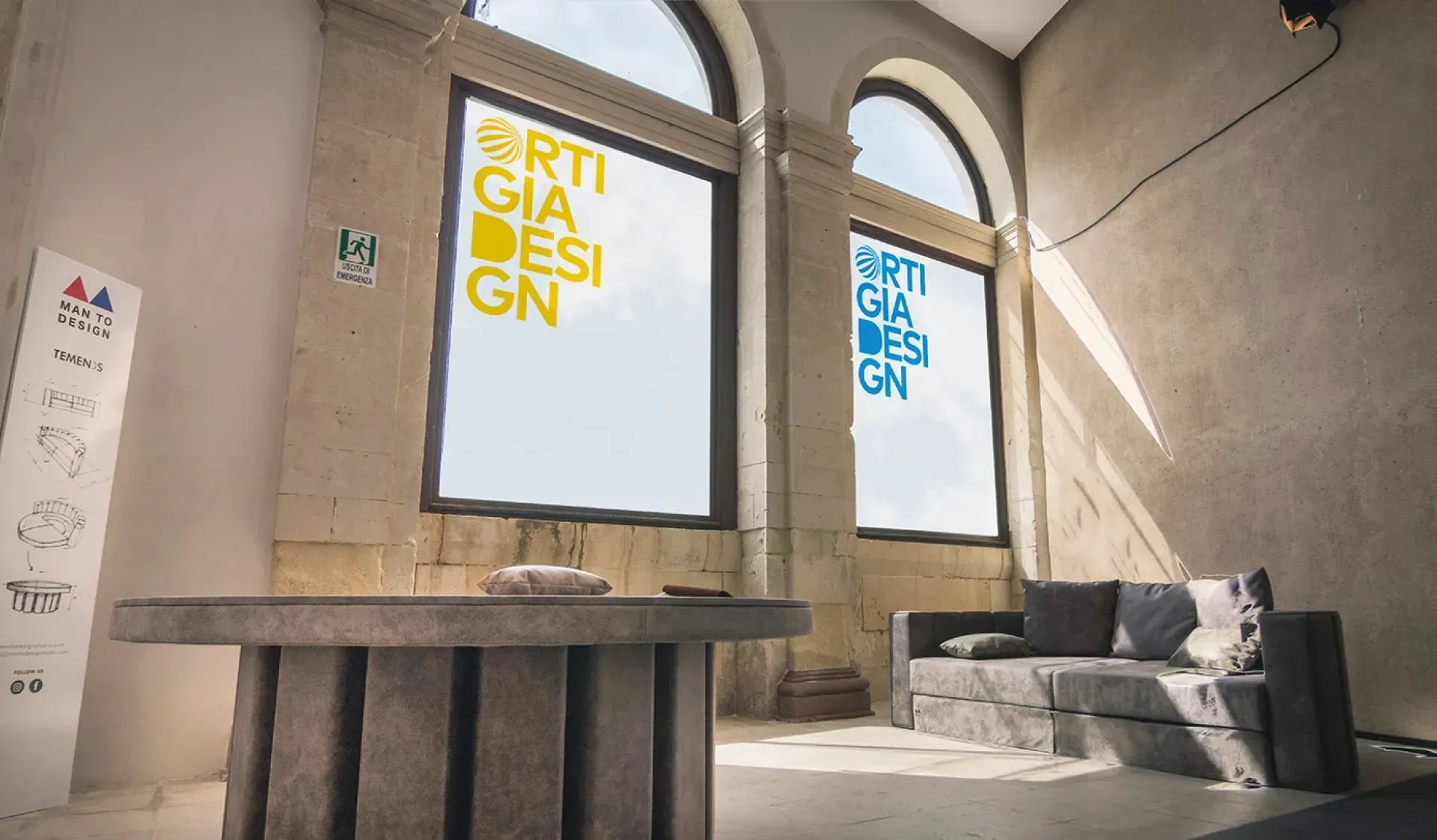
During the five days of the event, Ortigia became the meeting point of world design. That is why we turned the O into a globe, whose lines converge in the centre, it also appears as a 3D design object close to the concept of Optical Art. We wanted a symbol that would attract the public's attention, that would become strong and recognisable even if not accompanied by the logotype.
We chose to colour the O in cyan, to recall the colour of the sky and the sea, and the D in a warm yellow, for the colours of the island, whose architecture composed mainly of white stone actively interacts with the reflections of the sun. Finally, we slightly overlapped the two symbols, obtaining a chromatic and overprinting effect that characterised Italian graphics and design from the 1960s onwards.
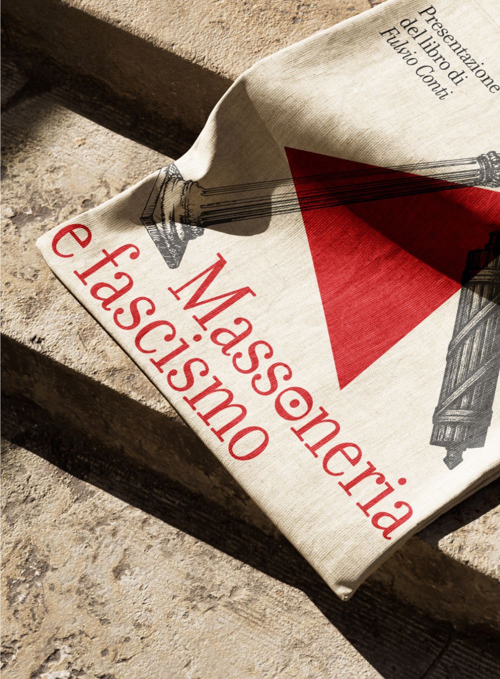
Massoneria and Fascismo