MN
Role
- Graphic Design
- Visual Identity
- Logo design
- Packaging Design
- Creative Direction
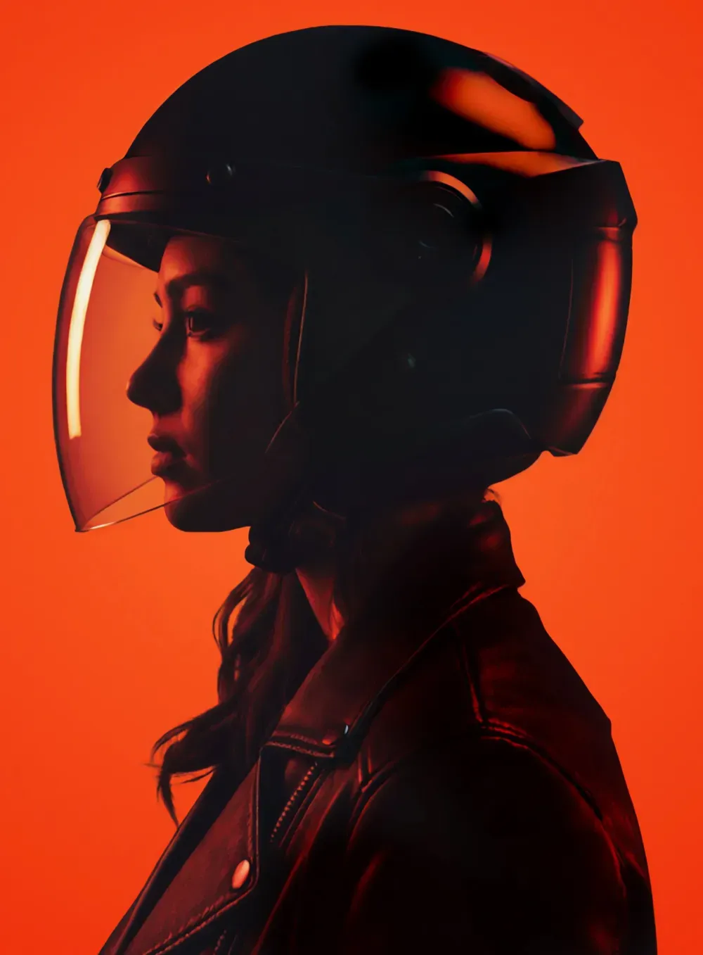
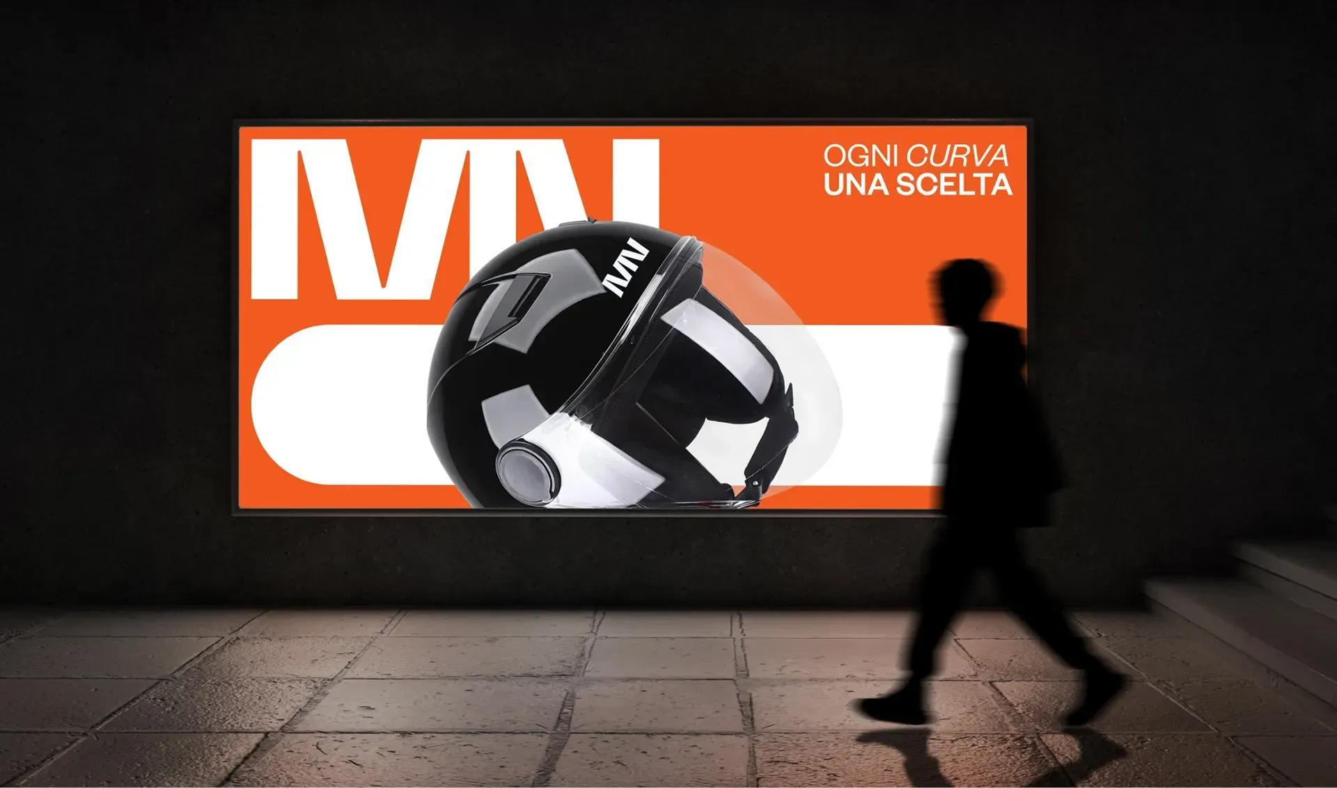
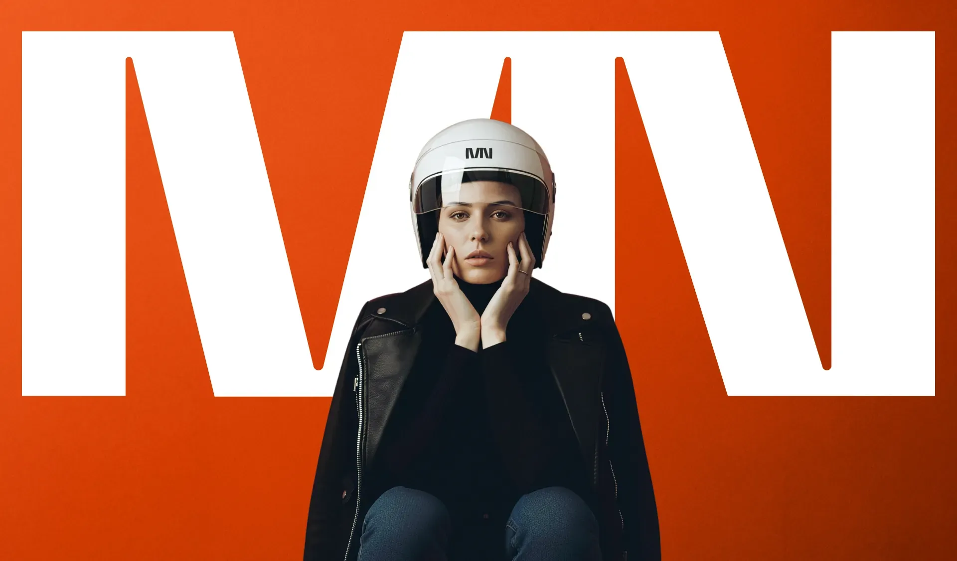
(INFO) MN is a new Italian motorcycle helmet brand that combines technical performance with a minimalist, contemporary aesthetic. Our work focused on designing the brand’s entire visual ecosystem. The challenge was to create a visual language capable of living on 3D surfaces while remaining iconic, bold, and unmistakable in every expression.
Concept
MN’s identity is rooted in geometric precision, high contrast, and a stripped-back visual rhythm.
In a market often overwhelmed by graphic overload, we pursued a direction that is technical, essential, and distinctly contemporary, the kind of clarity that stands out through silence rather than excess.
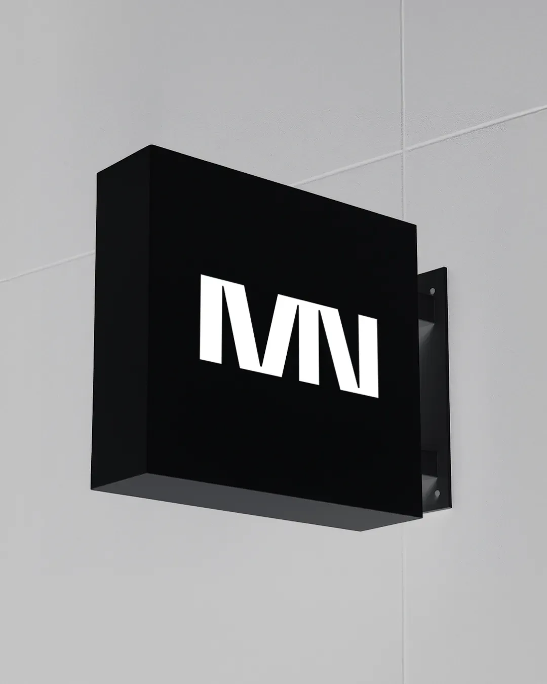
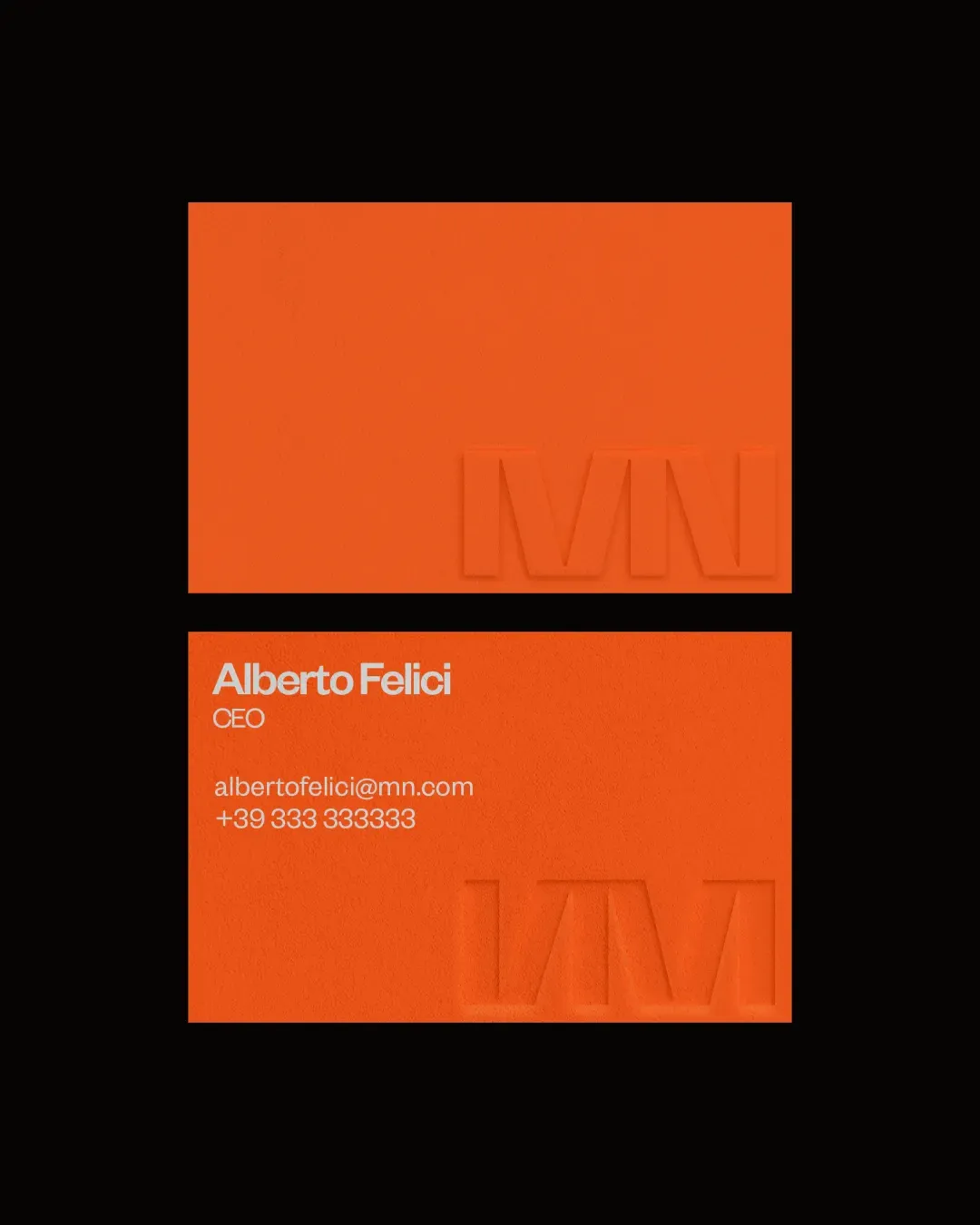
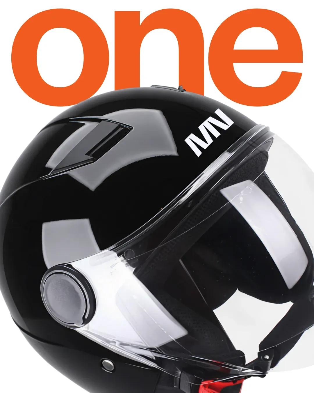
Logo and Construction
The MN monogram is built on a sharp, directional geometry. We designed the two letters to also function as a bold, standalone symbol immediately recognizable and visually impactful. Designed for high readability on curved surfaces, the logo becomes a structural element that anchors the entire visual system.

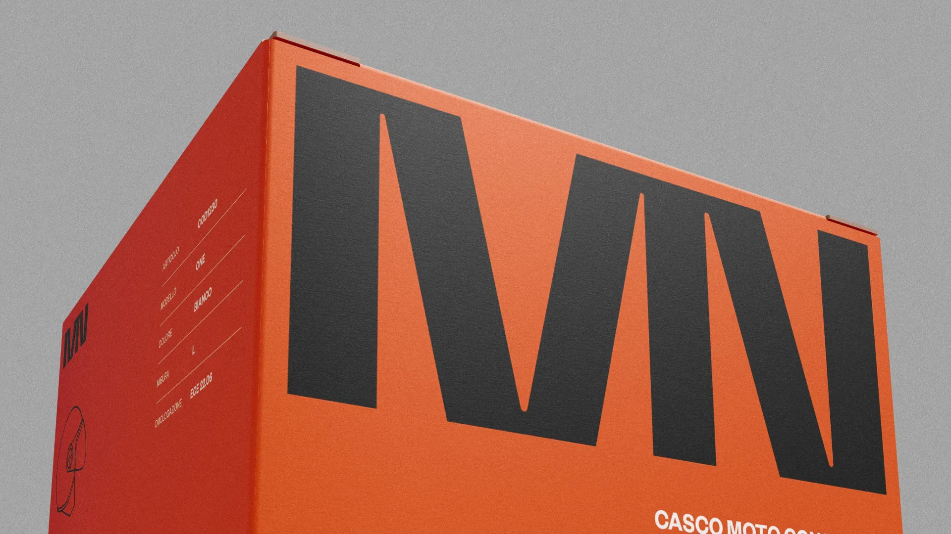
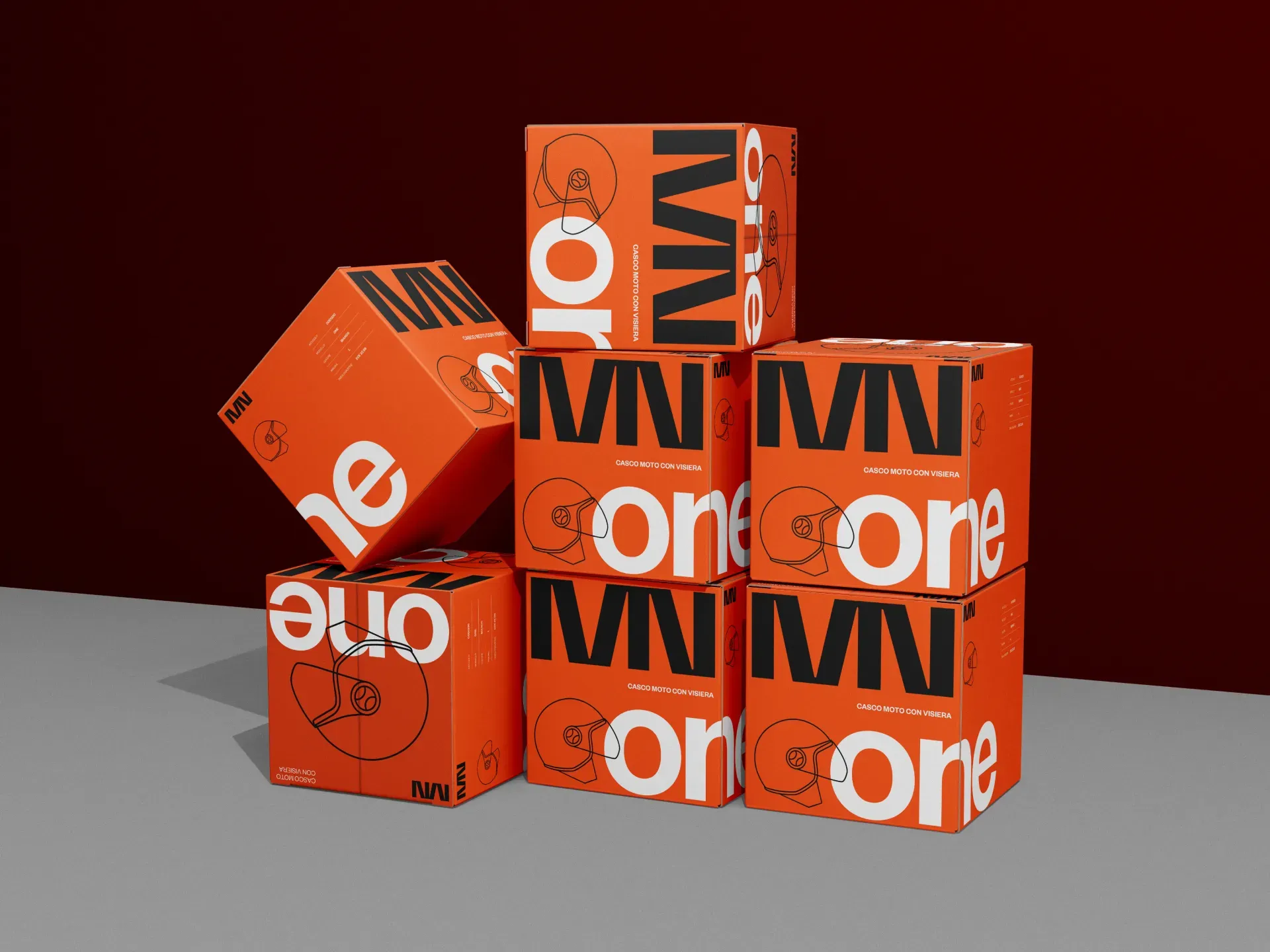
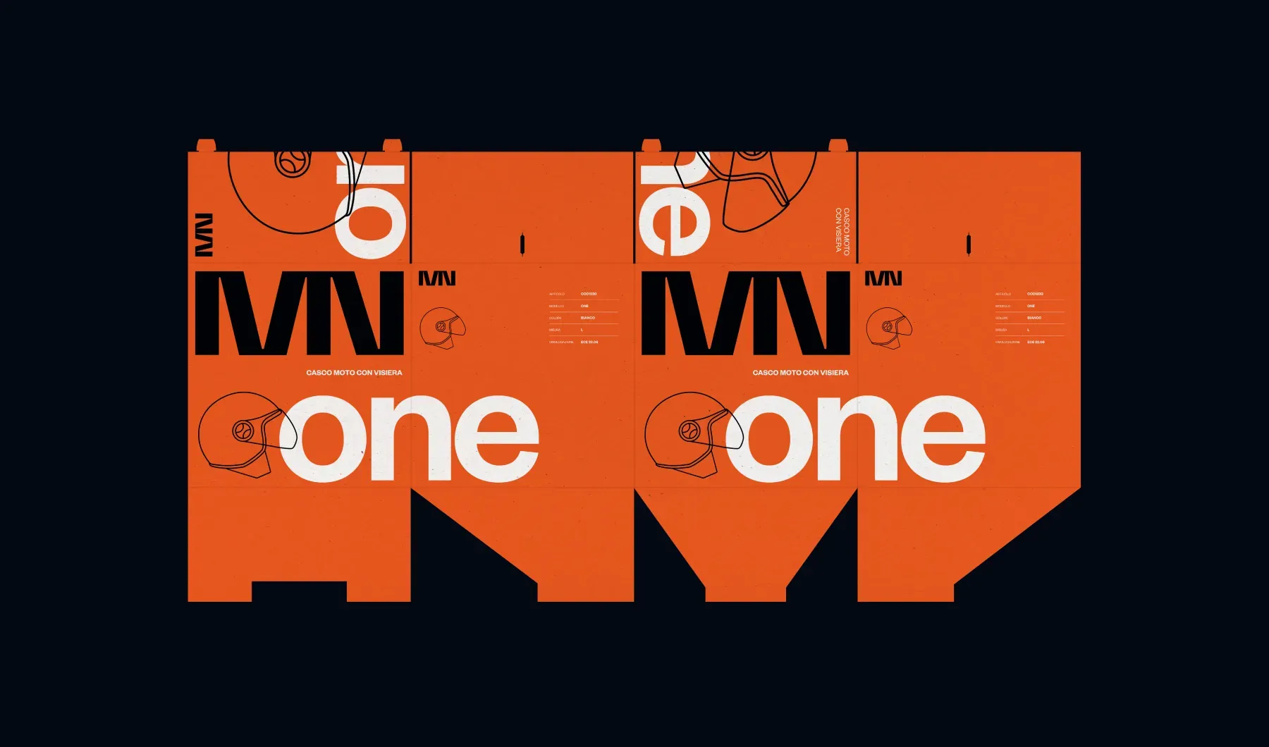
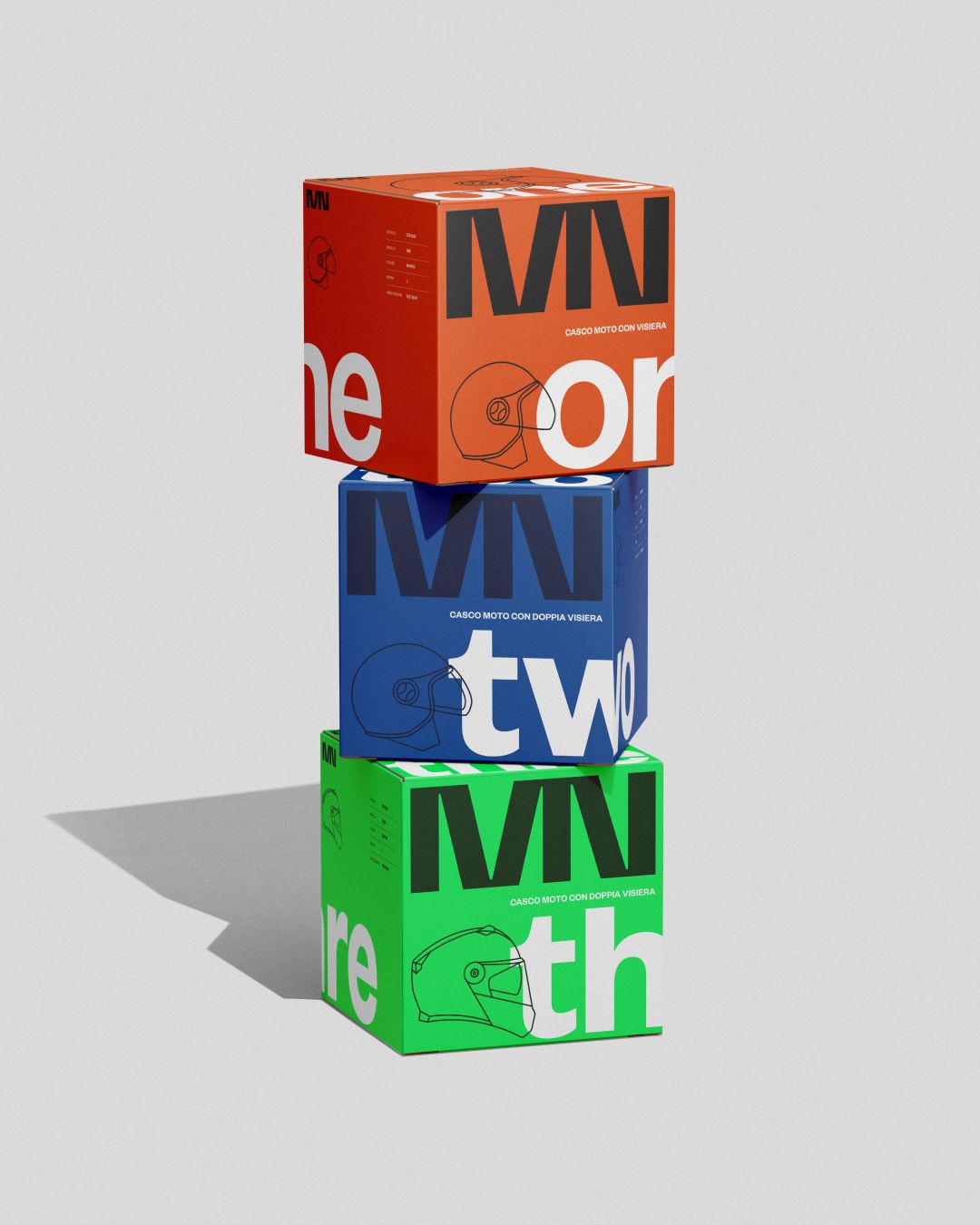
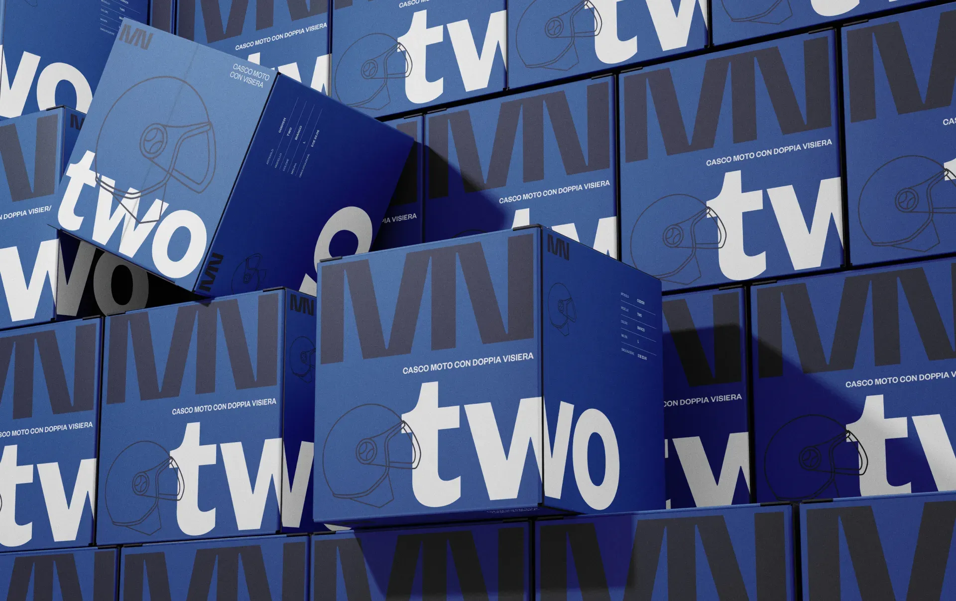
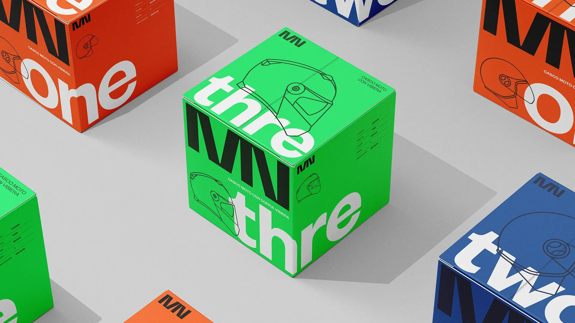
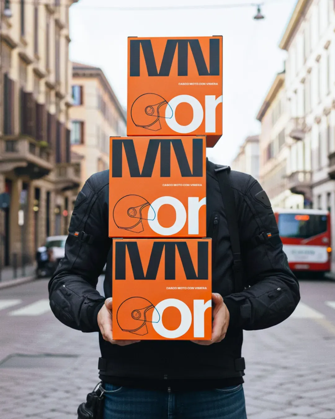
Packaging design
The packaging system was designed to give each helmet model a strong, unmistakable presence through its own dedicated color.
ONE adopts the brand’s signature warm red–orange, TWO is defined by a deep technical blue, and THREE introduces an acid green that pushes the identity into a more experimental direction.
Each box features oversized typography, minimal line illustrations, and bold contrasts, allowing the product line to remain cohesive while giving every model its own distinctive visual character.
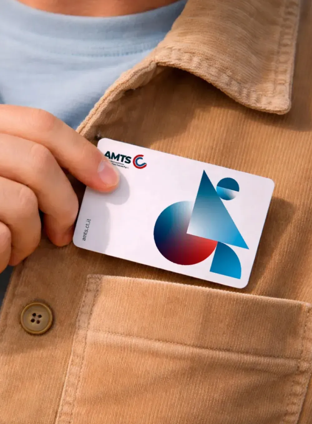
AMTS Card