July 01 | Typeface
Categories
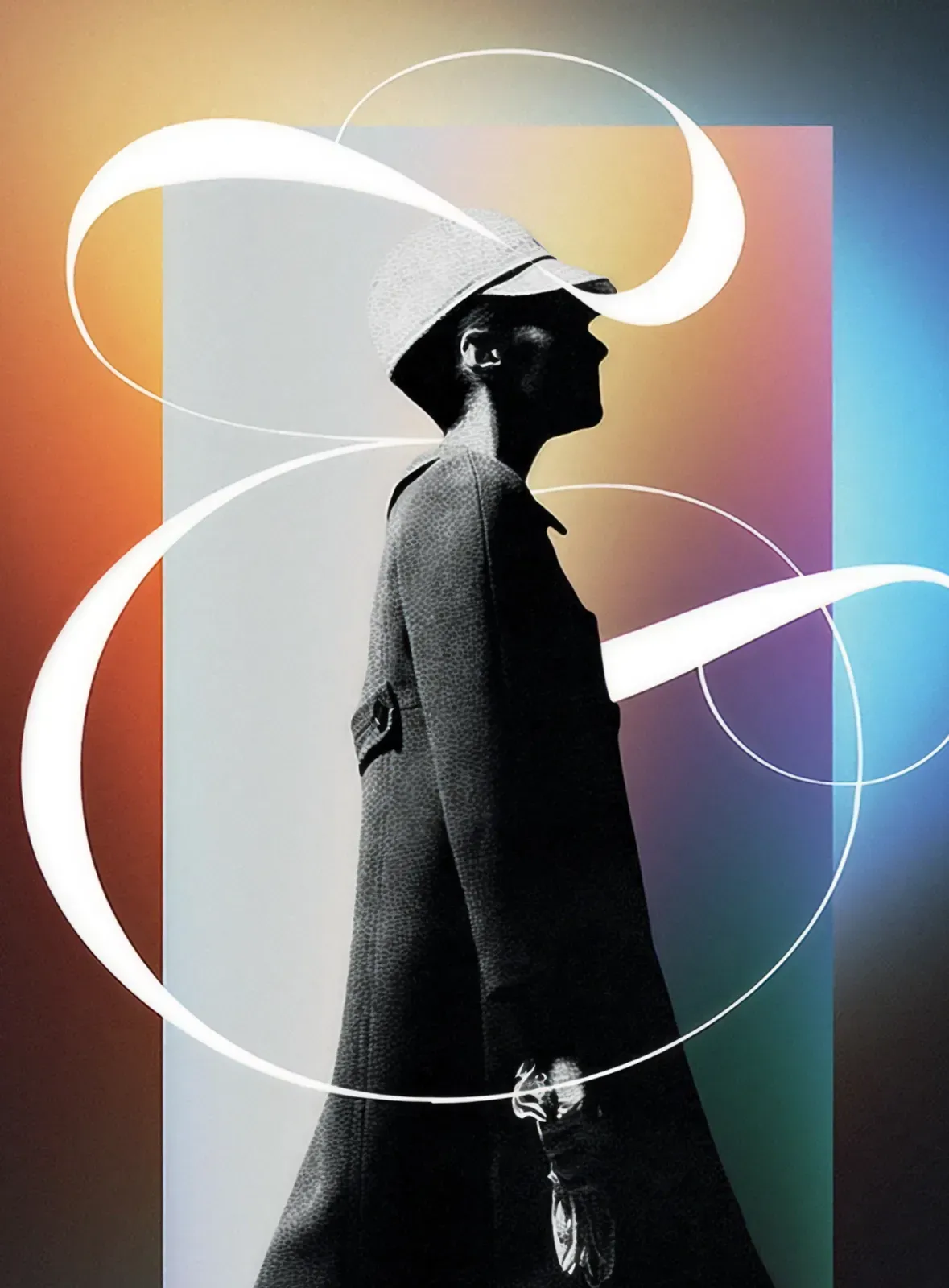
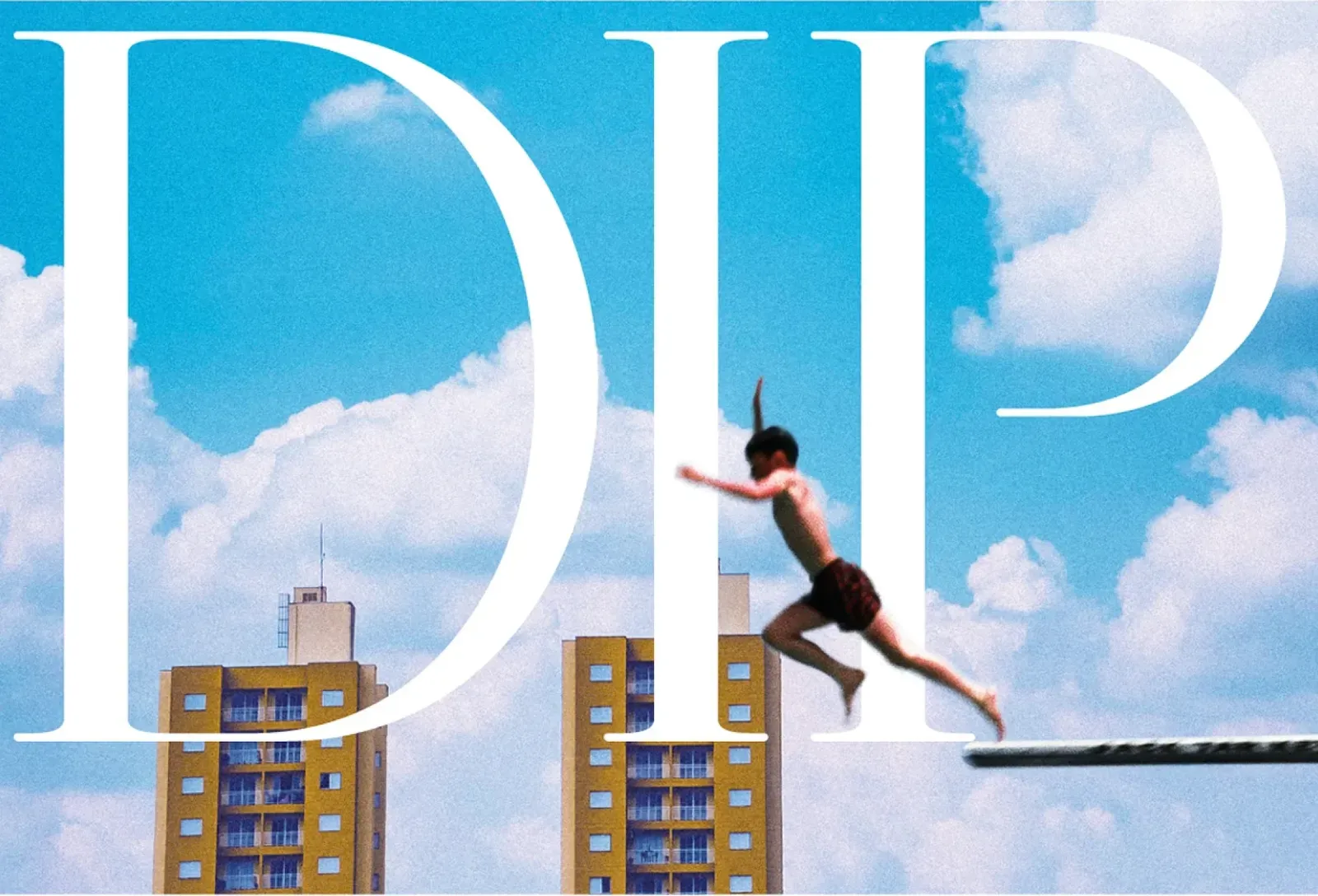
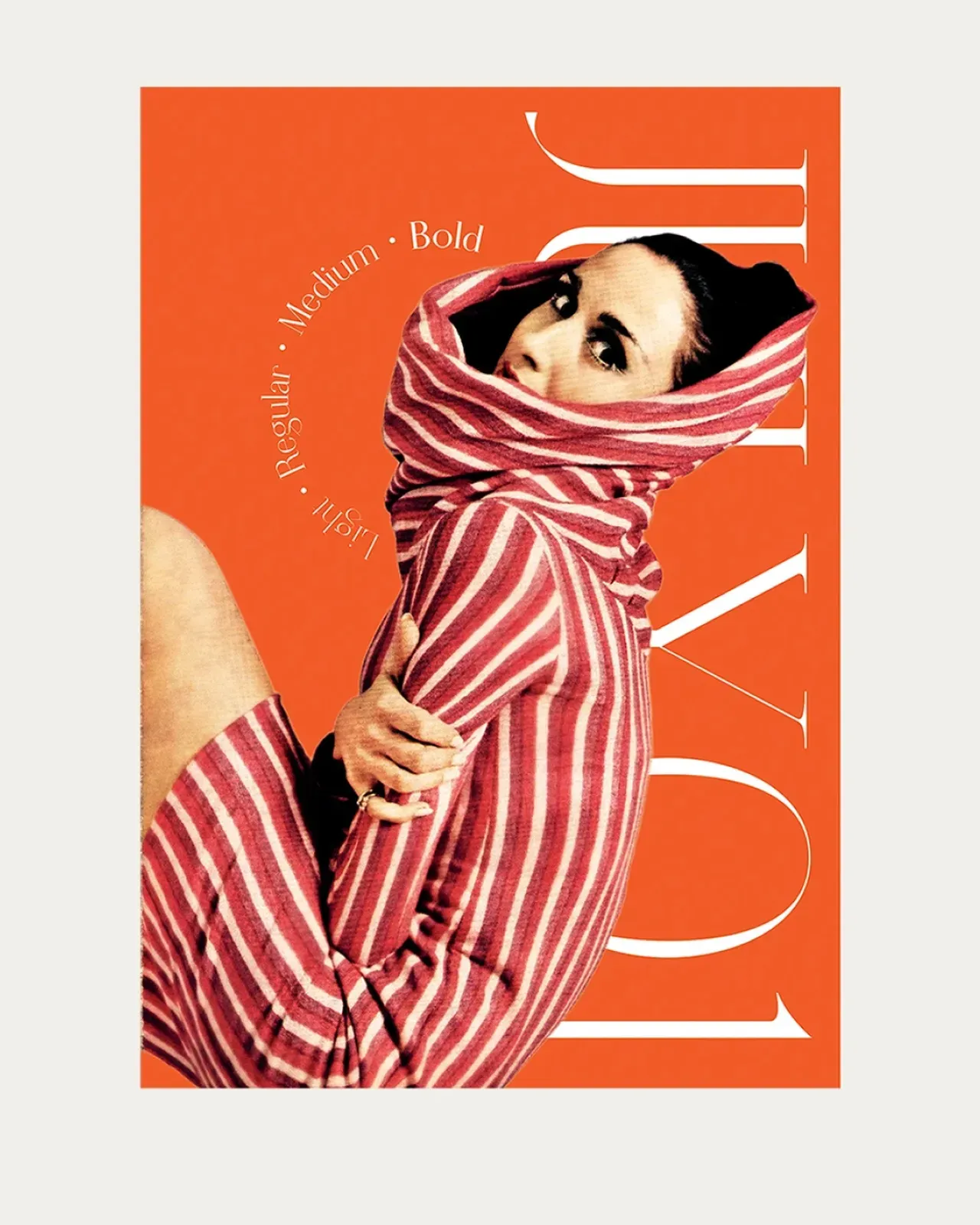
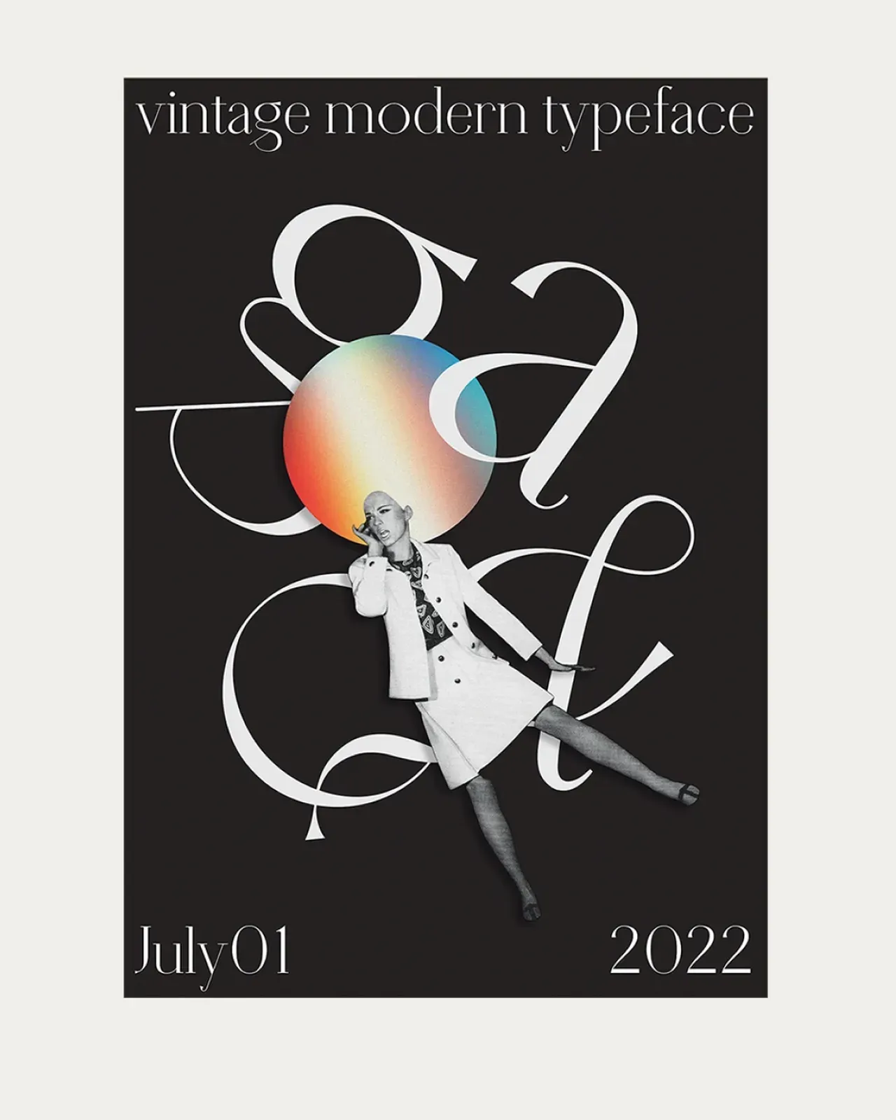
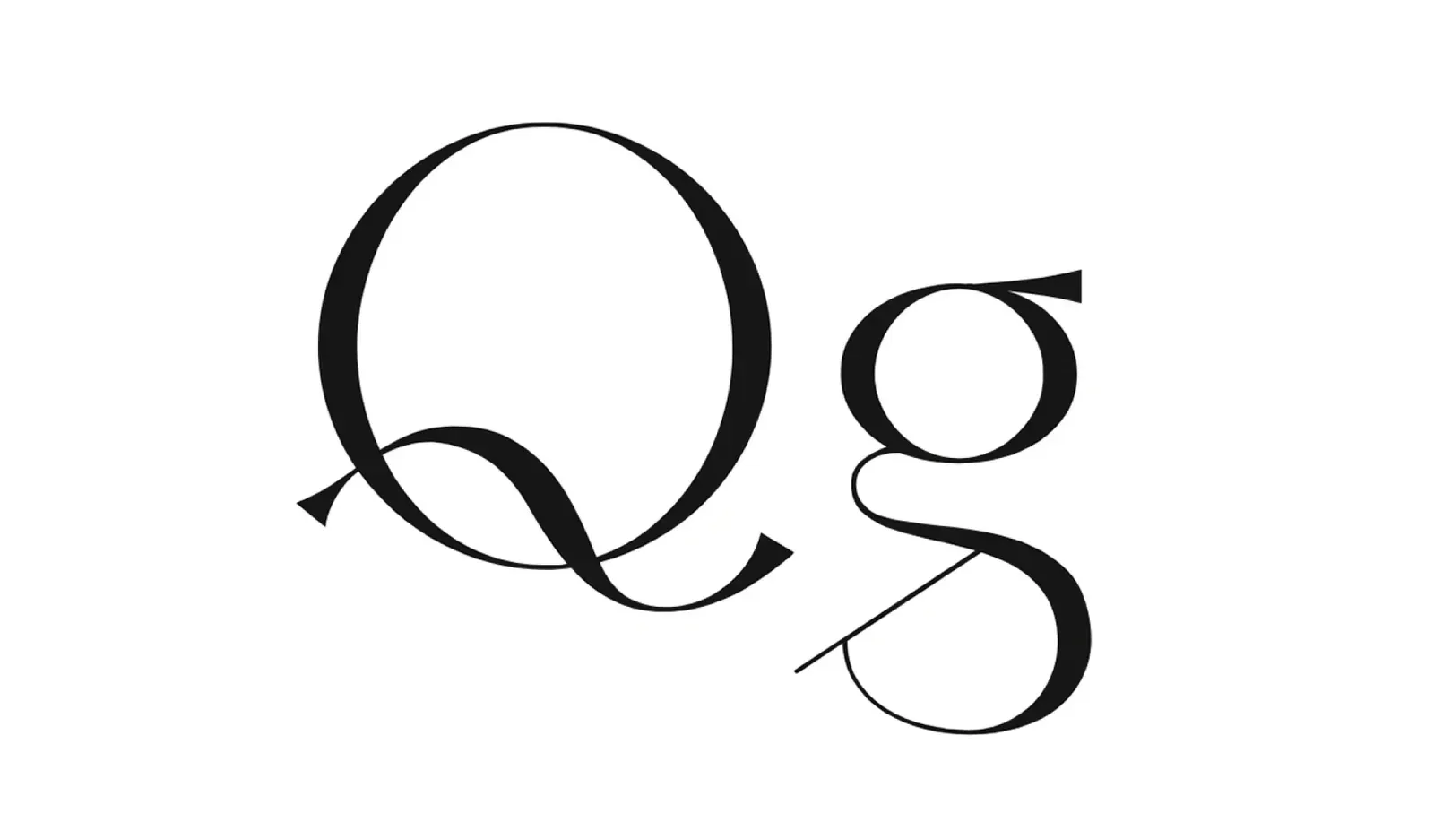
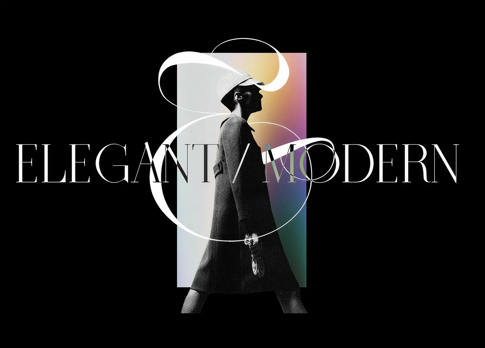
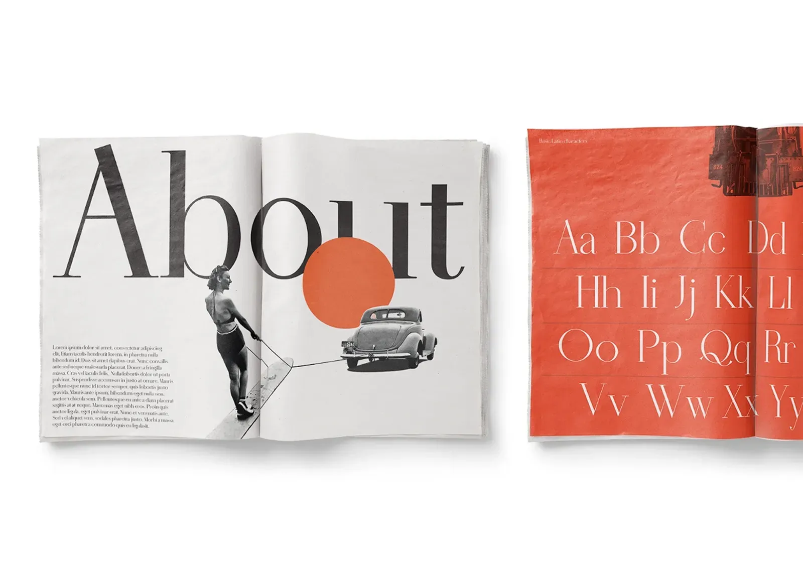
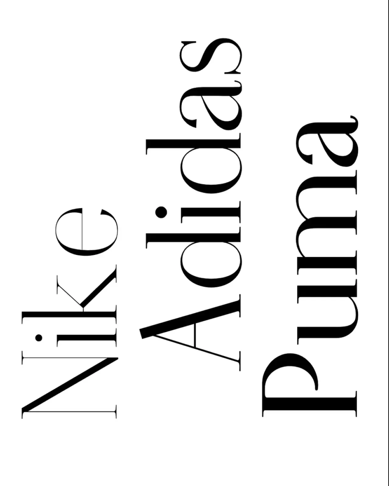
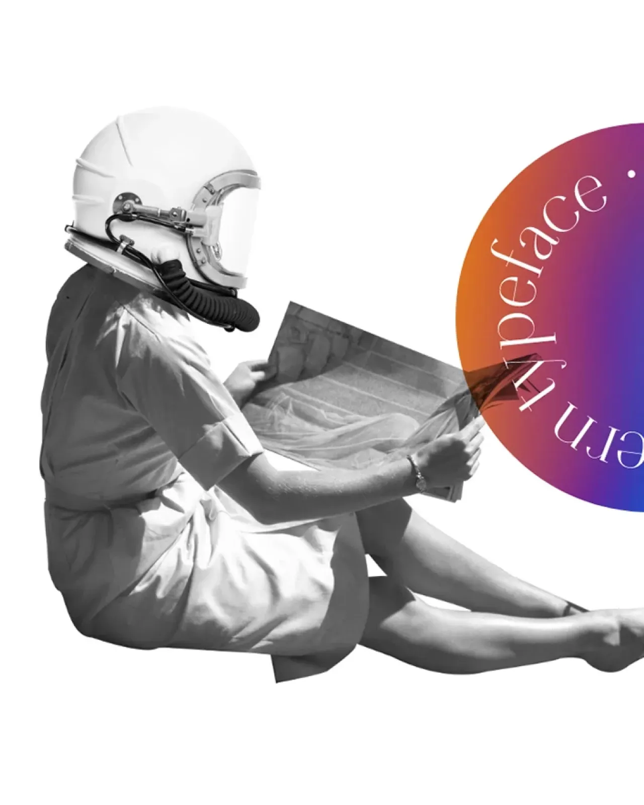
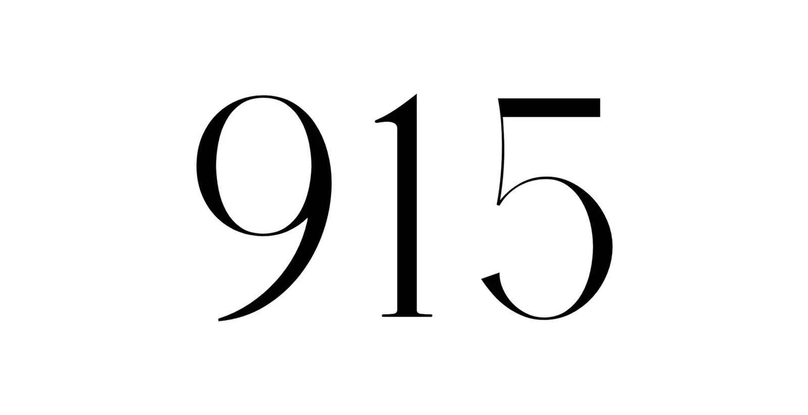
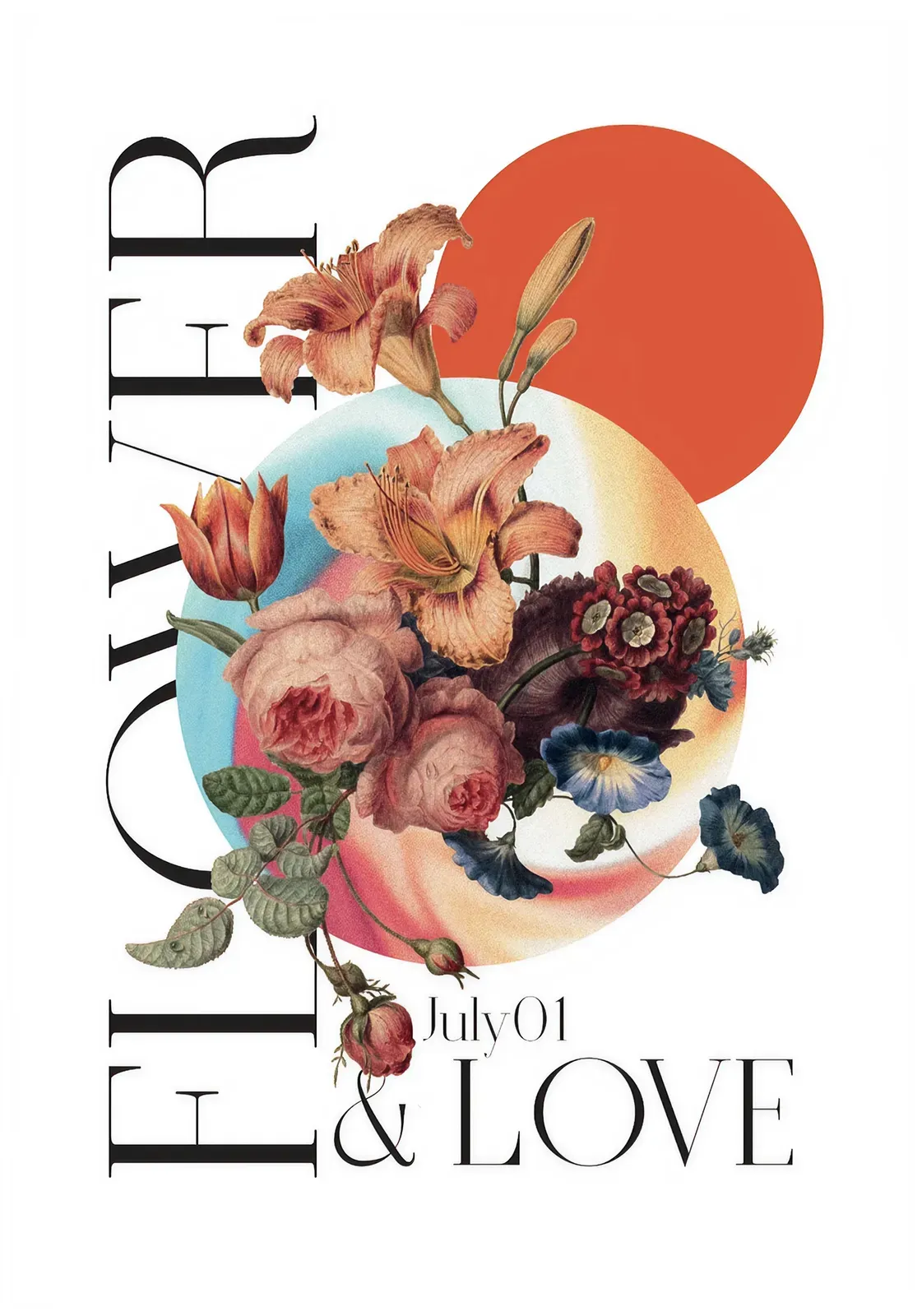
(INFO) July 01 is a display typeface with an elegant and assertive visual language, born from the meeting point between vintage references and contemporary sensibility. Its high-contrast structure recalls the Bodonian tradition, while reinterpreting it through more graphic, irregular and distinctive forms. The result is a typeface designed to give visual strength to headlines, covers, posters, magazines, websites and typographic compositions where letterforms become the main visual element.
Concept
The concept behind July 01 is built around contrast: between classic and modern, typographic rigor and expressive character, formal elegance and graphic impact.
Vertical and horizontal strokes interact through strong differences in weight, creating a visual tension that places the font close to the Bodonian family. Some letters have a more condensed structure, while others open up with wider proportions, generating a deliberately dynamic typographic rhythm.
July 01 is mainly conceived as a graphic font. It is not designed for long texts or very small sizes, but for contexts where typography needs presence, recognizability and narrative strength: headlines, visual identities, artwork, editorial design and high-impact digital layouts.

AL Rappresentanze