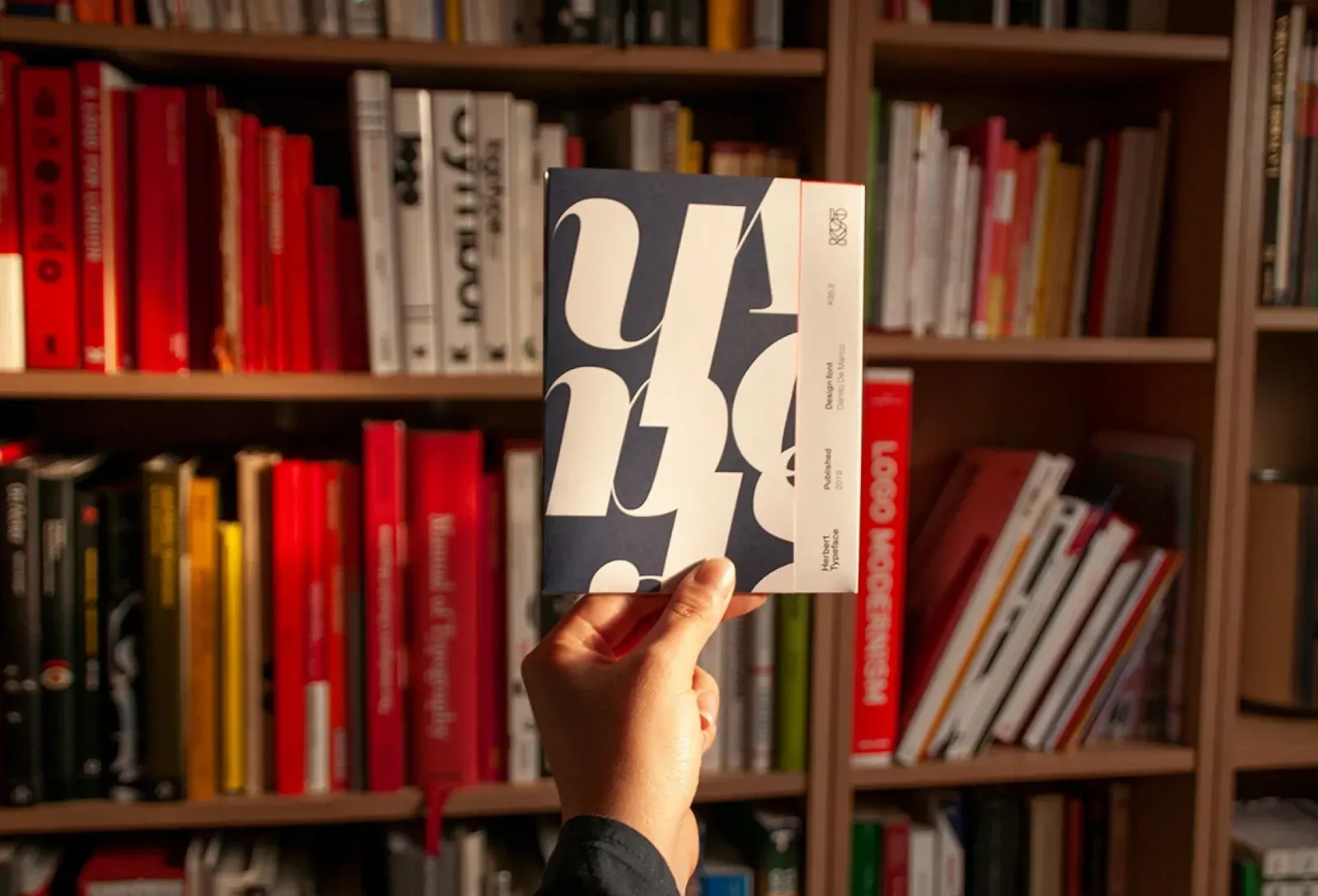
Herbert Typeface
Categories
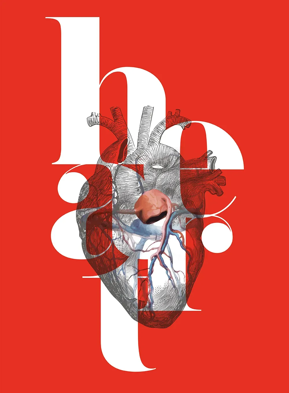
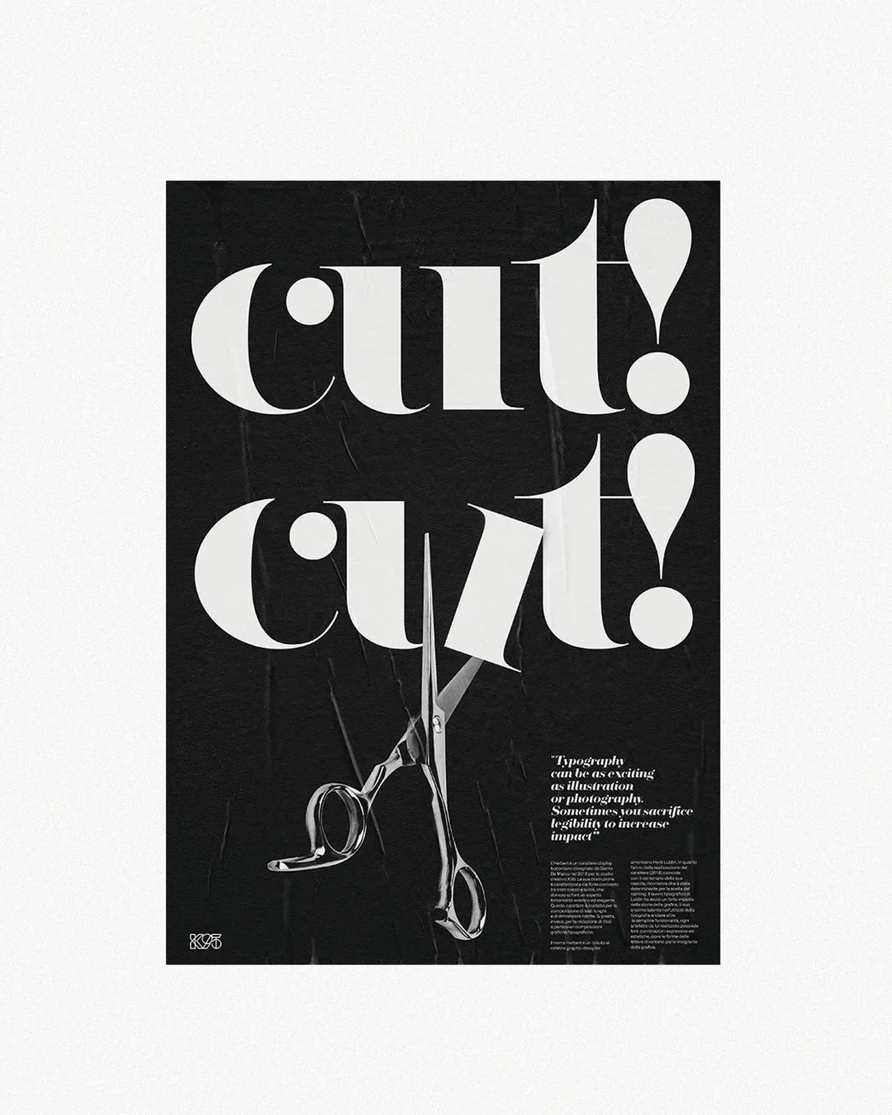
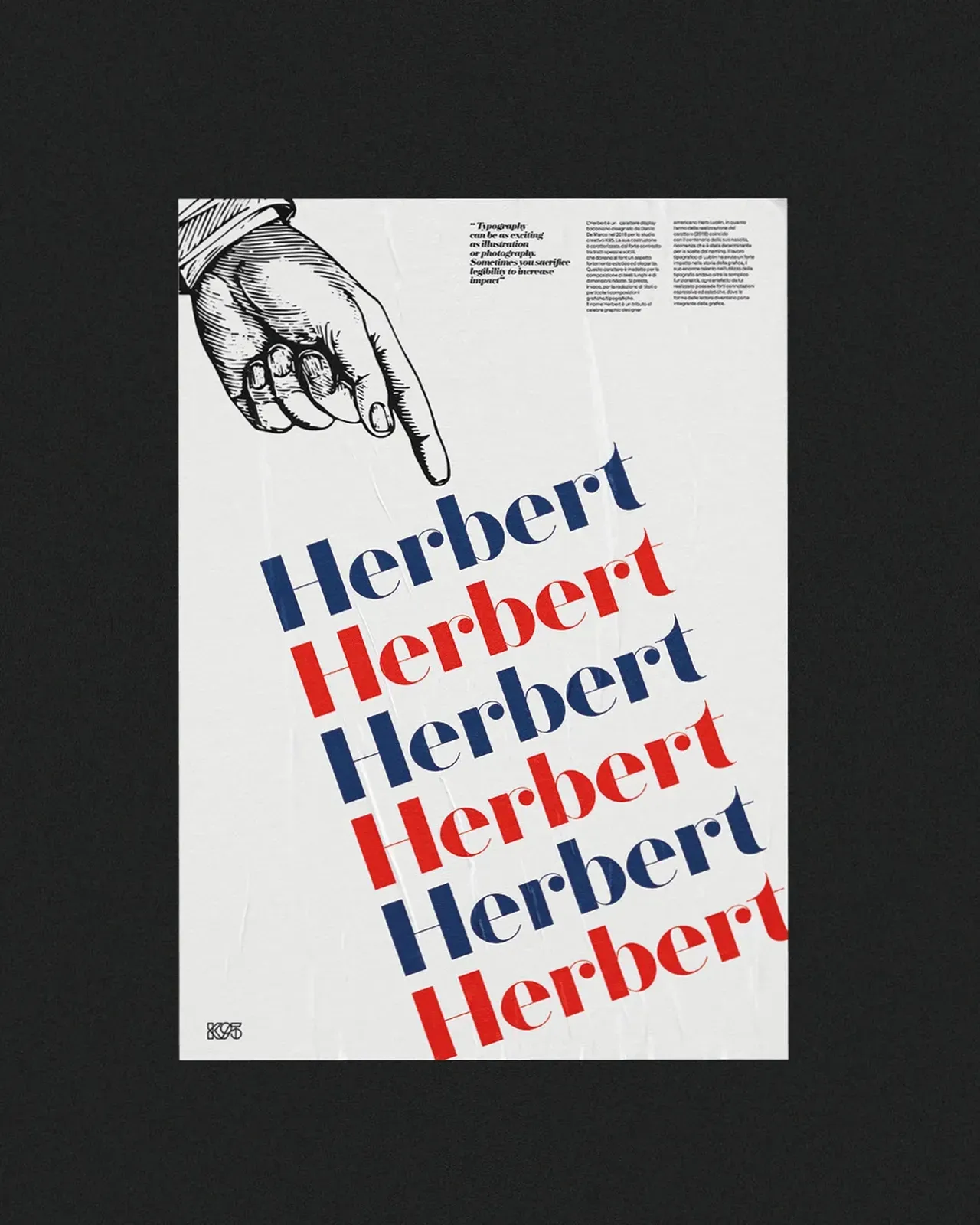
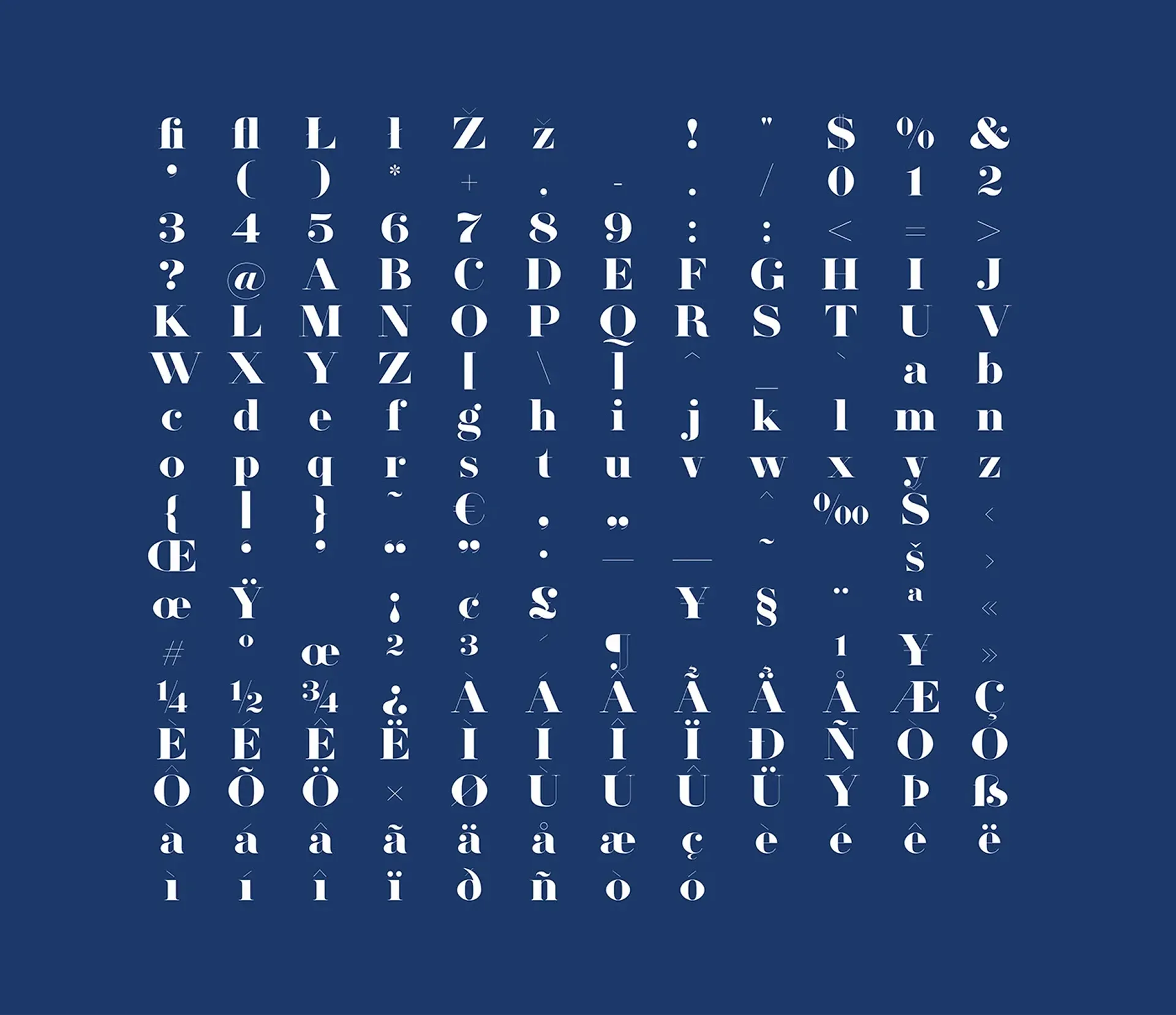
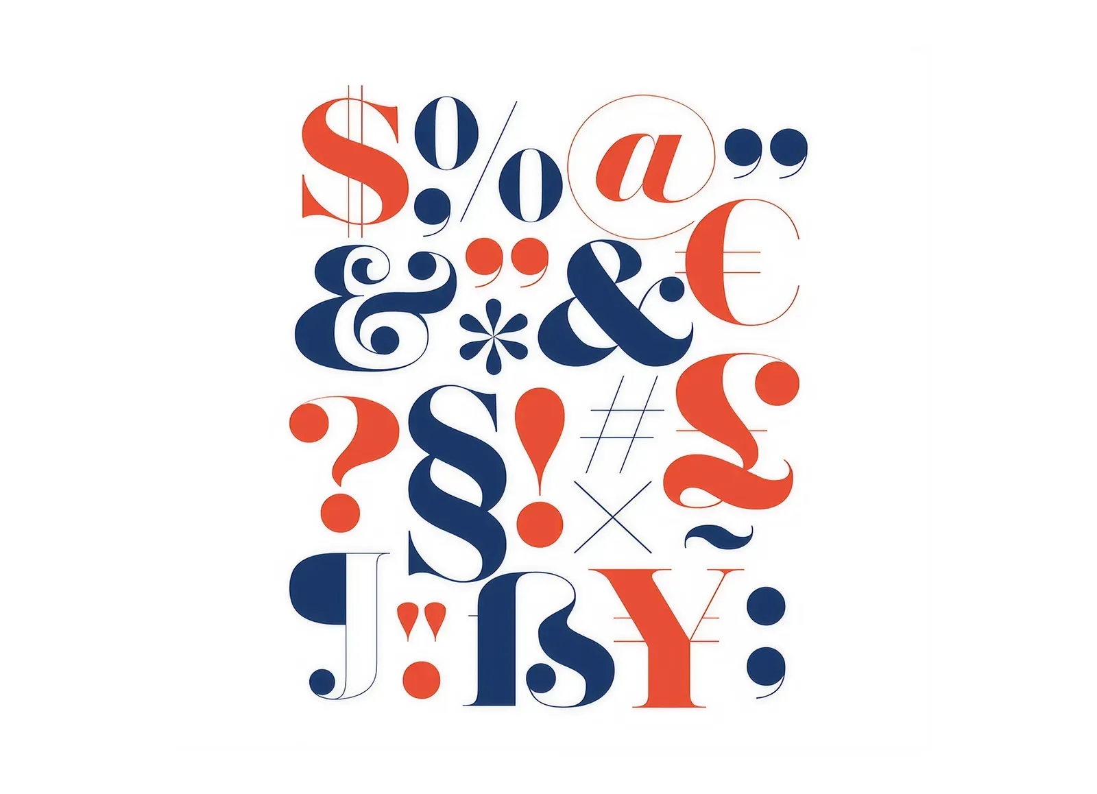
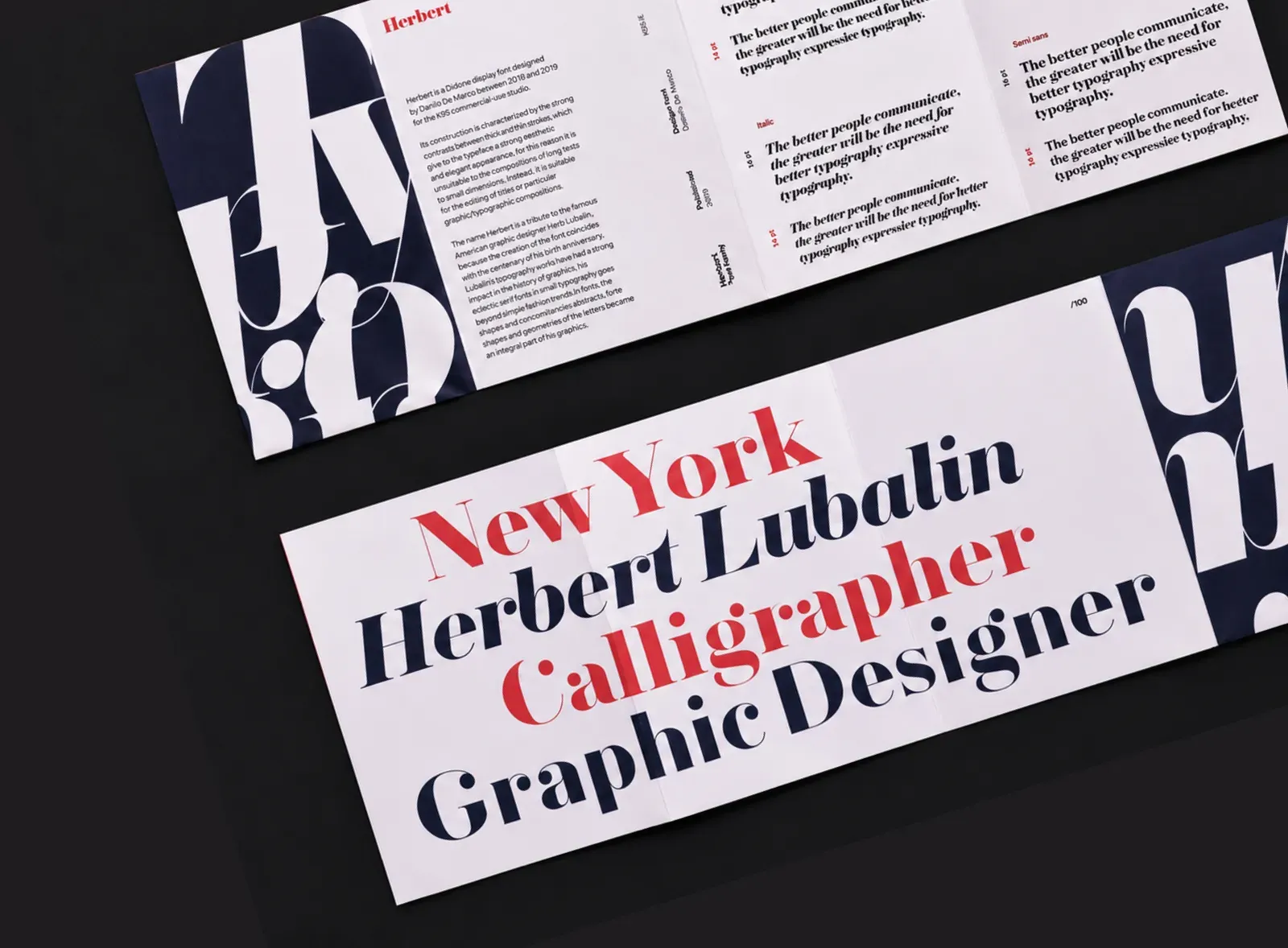
(INFO) Herbert is a display typeface designed by Danilo De Marco for Studio K95, born from a formal research on the relationship between elegance, contrast and the expressive power of letterforms. Its construction draws from the Didone tradition, reinterpreted through a sharp, contemporary and highly scenic visual language. Thin strokes and bold contrasts create a strong visual tension, making Herbert particularly suitable for headlines, posters, visual identities and impactful typographic compositions.
Concept
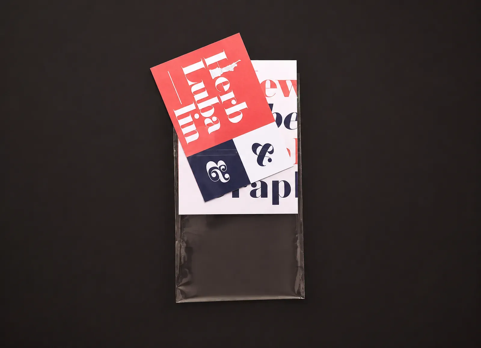
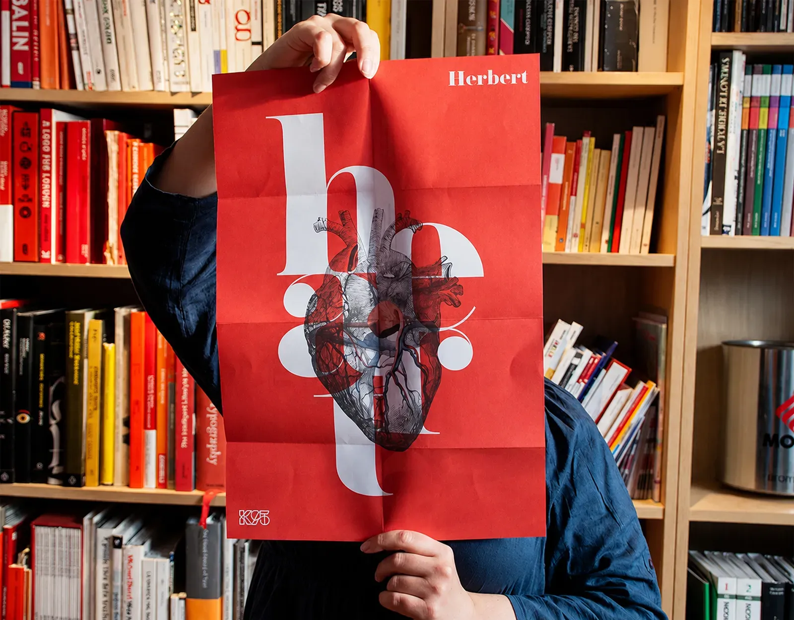
The project comes from the idea of treating typography not only as a functional tool, but as an autonomous visual matter. In Herbert, each letter becomes a graphic form capable of building rhythm, contrast and presence. The name is a tribute to Herb Lubalin, a key figure in the history of American graphic design, whose work showed how typography could move beyond simple readability and become language, image and composition.
Herbert follows this direction: an elegant and assertive display font, designed for projects where typography takes on a leading role. Its thin, vertical and strongly contrasted forms build a sophisticated visual identity, ideal for headlines, posters, editorial design and graphic systems where text does not simply support the image, but becomes the image itself.

Salvo Canuti | Marocco