Kalopsee


-
Client
Kalopsee
-
Year
2020
-
Creative Fields
Branding, Advertising
Kalopsee is a Canadian company from Vancouver that deals with Information Technology Consulting, Business Analysis, Project Management, Business Intelligence and AR (Augmented Reality), services offered through the use of AR devices.
The name Kalopsee comes from Kalopsia, a word with Greek roots Kallos meaning beauty and opsis (eyes). In English the word Kalopsia can also mean beautiful sight or with beautiful eyes.


Target
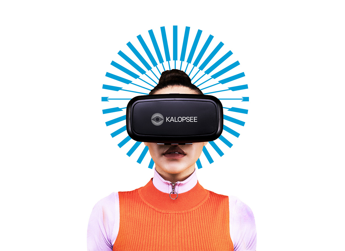
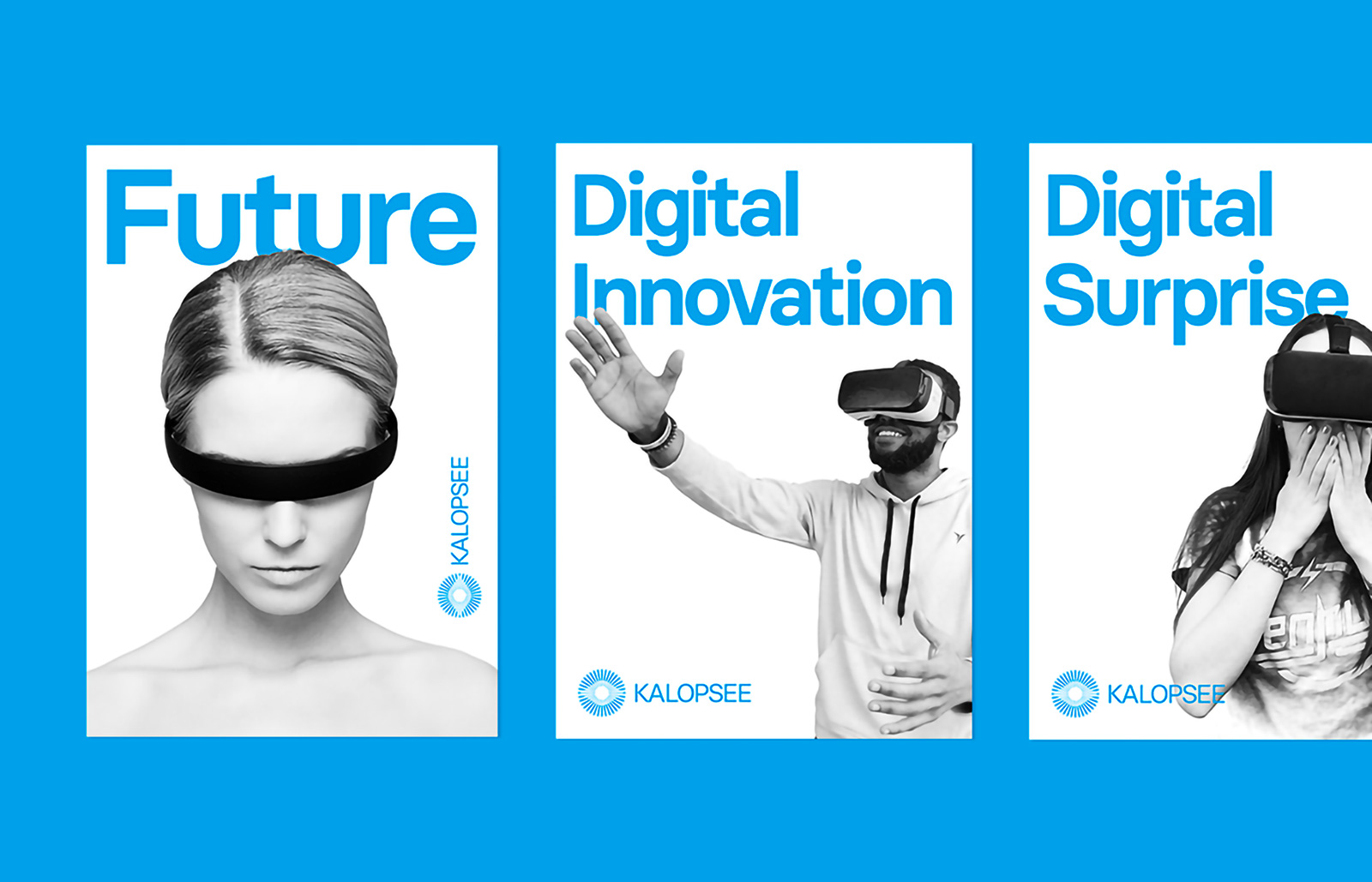
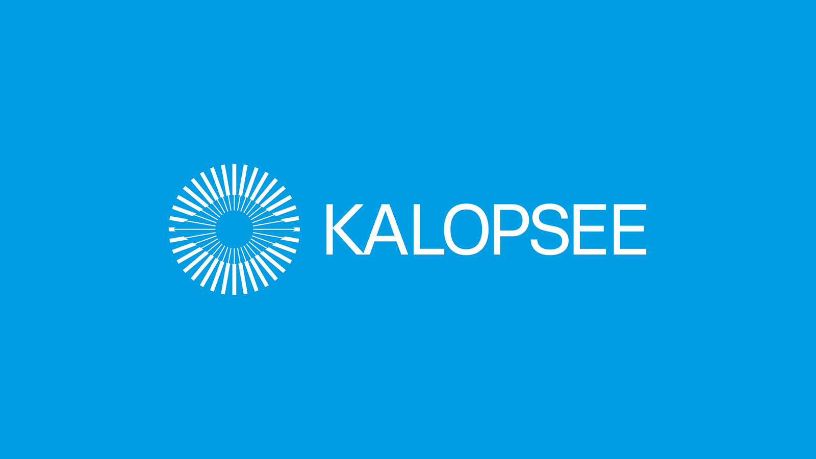
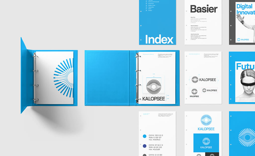
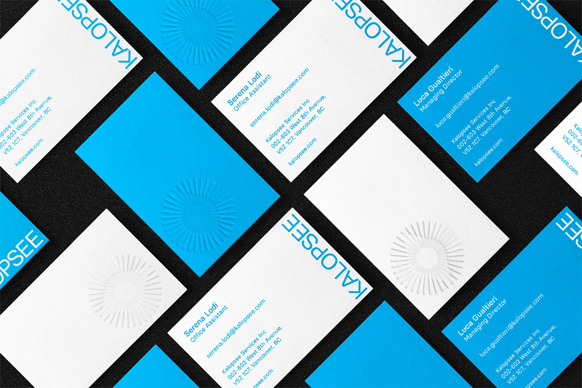
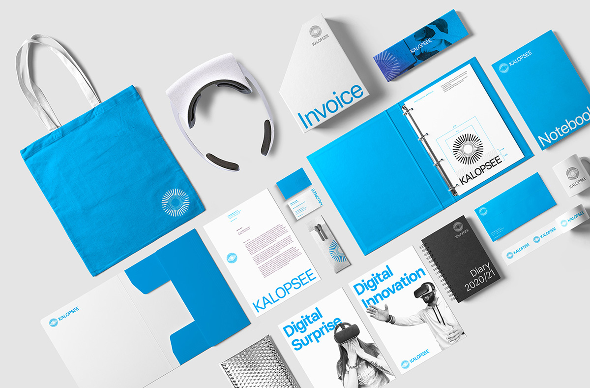
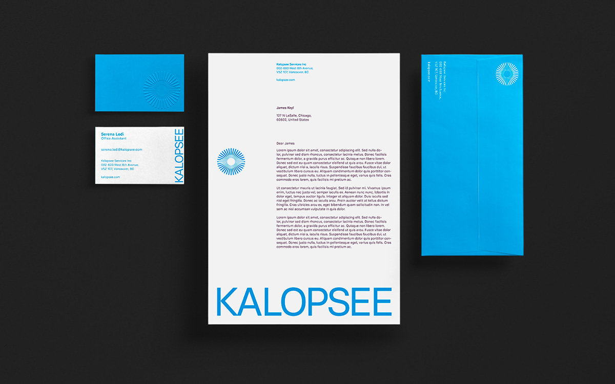
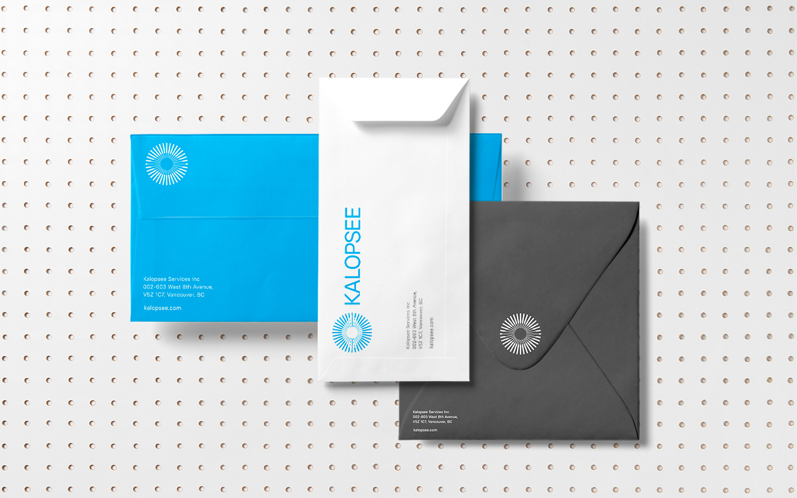
The client requested a visual identity that recalled the Greek origin of the name. In the various proposals presented, we decided to keep the presence of the eye constant. The brand must be able to transmit looking beyond, imagining a future characterized by the constant presence of AR technologies. To convey these sensations, we decided to focus on an optical mark, consisting mainly of an eye surrounded by rays. The visual identity has a minimal aesthetic, as do the posters designed to advertise the company using digital channels.
Technologies

Colors Palette
-
CMYK: 100 0 0 0
RGB: 0 158 226
Hex: #009EE2
-
CMYK: 0 0 0 90
RGB: 60 60 60
Hex: #3C3C3B
-
CMYK: 0 0 0 40
RGB: 177 177 177
Hex: #B1B1B1
Branding
Advertising
